Planning a bedroom repaint in Belgravia? This guide explains how to choose soft colours, test samples in daylight and evening light, prepare the walls properly, and create a restful finish that works with fabrics, trim, flooring, and lighting.
The practical answer: A Belgravia bedroom repaint should make the room feel calm in the evening, fresh in daylight, and soft enough for daily life. The best result comes from careful wall preparation, large colour samples, the right matt finish, and a trim colour that works with fabrics, flooring, and lighting. In a high end bedroom, the goal is not just a clean repaint. It is a room that feels settled, restful, and beautifully finished. For a full interior finish plan, see our interior painting and decorating service.
A bedroom in a Belgravia home needs a different kind of decorating decision from a hallway, kitchen, or formal reception room. It is more private, more personal, and usually more sensitive to light. The colour has to feel good first thing in the morning and last thing at night. The finish has to be calm rather than shiny. The walls need to look smooth, because low lamps and soft side light can reveal small flaws that are easy to miss during the day.
Many bedroom repaint projects begin with a simple question. What colour should we use? That matters, of course, but it is not the only question. In a refined bedroom, the quality of preparation, the relationship between walls and trim, the undertone of the colour, and the way the room is lit all matter just as much. A good repaint should feel quiet and effortless, even when a lot of thought has gone into it.
This guide explains how to plan a Belgravia bedroom repaint so the room feels calm, elegant, and properly finished.
Before looking at colour charts, decide what the room needs to feel like. Some bedrooms should feel bright and light. Others should feel more cocooning, especially if they are used mostly in the evening. A guest bedroom may need to feel welcoming and flexible. A principal bedroom may need a softer, more layered scheme that works with curtains, headboards, rugs, and art.
Useful starting questions include:
These answers make colour choice much easier. A bedroom that needs calm should not be treated like a formal sitting room. The palette can be simpler, softer, and more restful.
Belgravia bedrooms can vary a lot in light. Some have large sash windows and open views. Others face quieter streets, gardens, courtyards, or light wells. The same colour can feel completely different depending on the room.
North facing bedrooms often need warmth. A cool grey or very clean white can feel flat, especially on cloudy days. South facing rooms can handle softer neutrals more easily, but very creamy tones may become too warm in strong afternoon light. East facing rooms can feel bright in the morning and cooler later in the day. West facing bedrooms can become warmer in the evening.
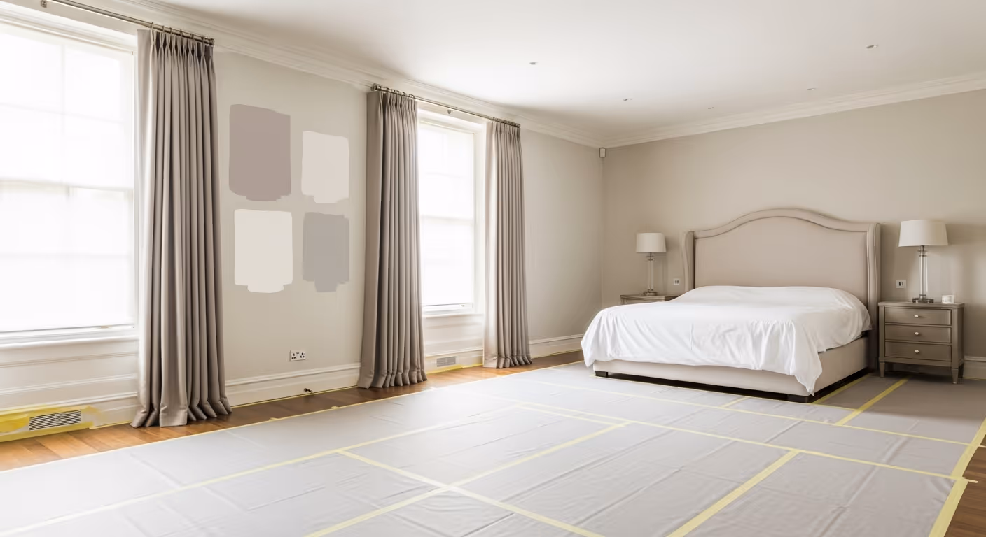
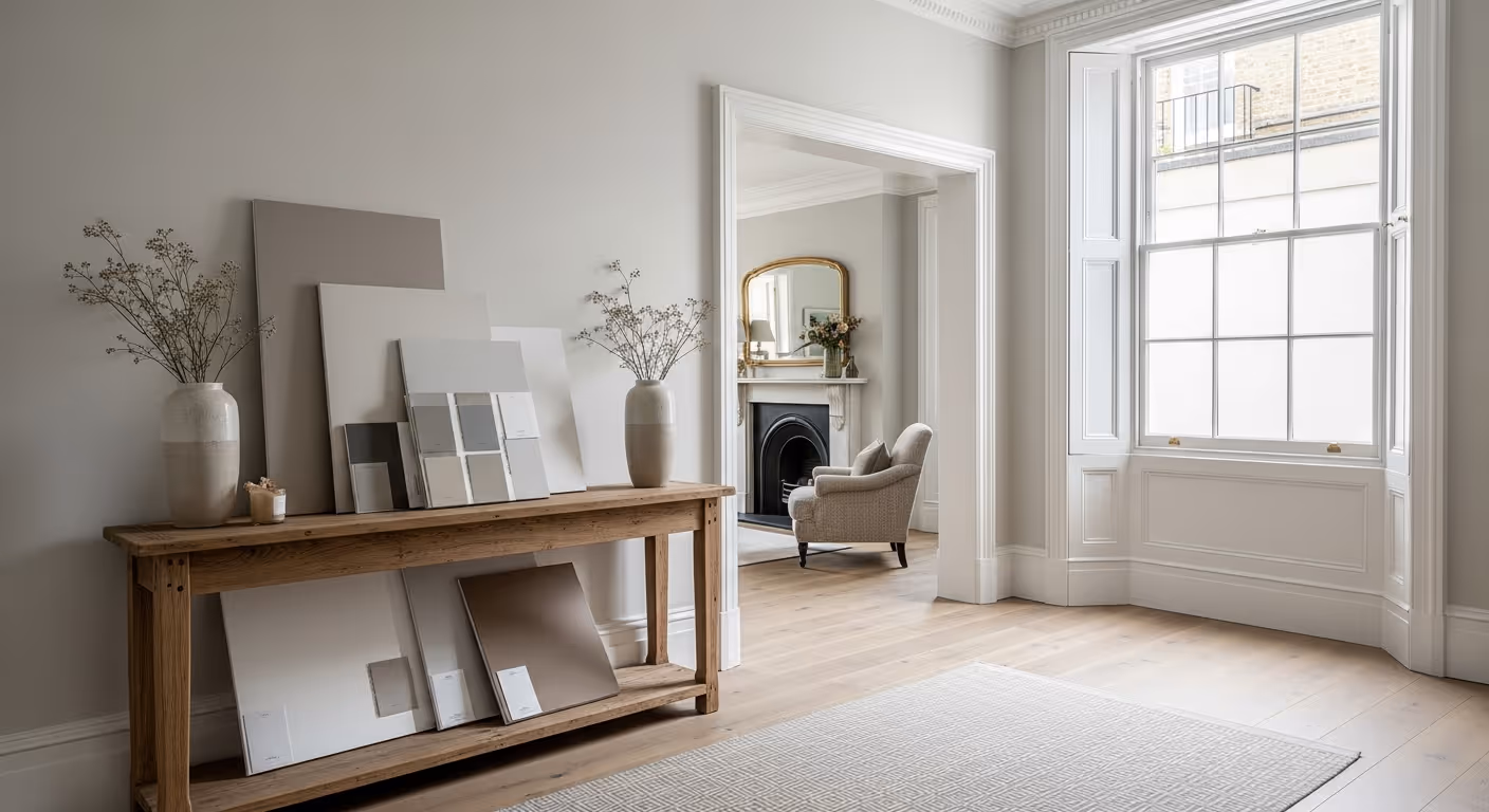
This is why the colour should be tested in the room, not chosen from a small card. The sample needs to be seen near the window, beside the bed, and in the area that receives lamp light at night.
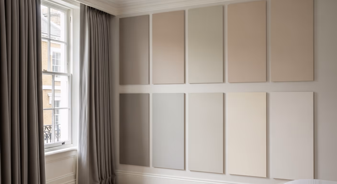
For high end bedrooms, the best colours are often quiet rather than dramatic. A bedroom does not need to shout. It needs to make the whole room feel considered. Soft neutrals work well because they allow the bed, fabrics, furniture, art, and lighting to carry the character.
Strong directions often include:
Very bright white can feel too sharp in a bedroom, especially beside soft fabrics. Cool grey can feel elegant on a card but cold on a wall. The best neutral usually has enough warmth to feel comfortable, but not so much that it becomes yellow or heavy.
Not every bedroom needs to be pale. A deeper colour can work beautifully when the room is used mainly in the evening or when the design is meant to feel restful and enclosed. The key is restraint. A deep colour should feel soft and layered, not harsh.
Deeper colours can work well in:
Good deeper options might include muted olive grey, warm taupe, soft tobacco, deep stone, or gentle brown based neutrals. The colour should still feel calm. If it feels too bold during the sample stage, it will probably feel stronger once it covers every wall.
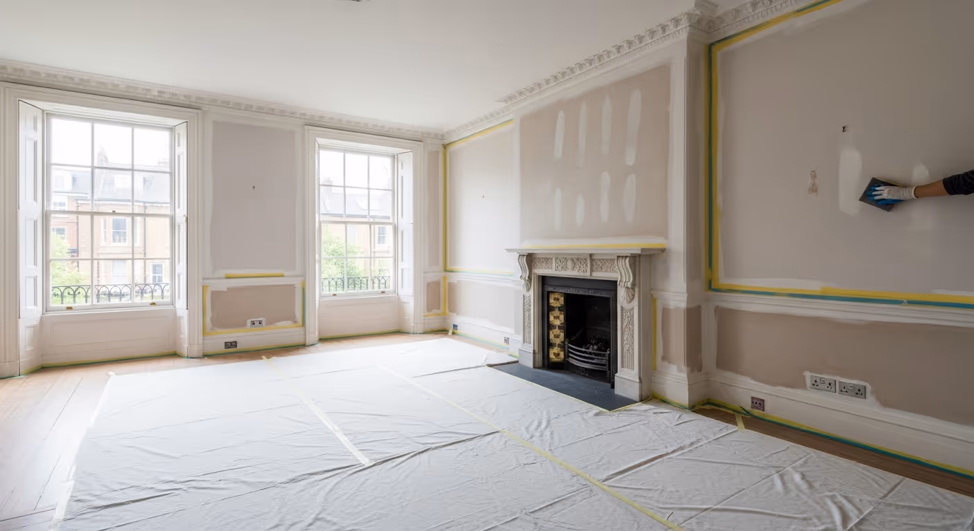
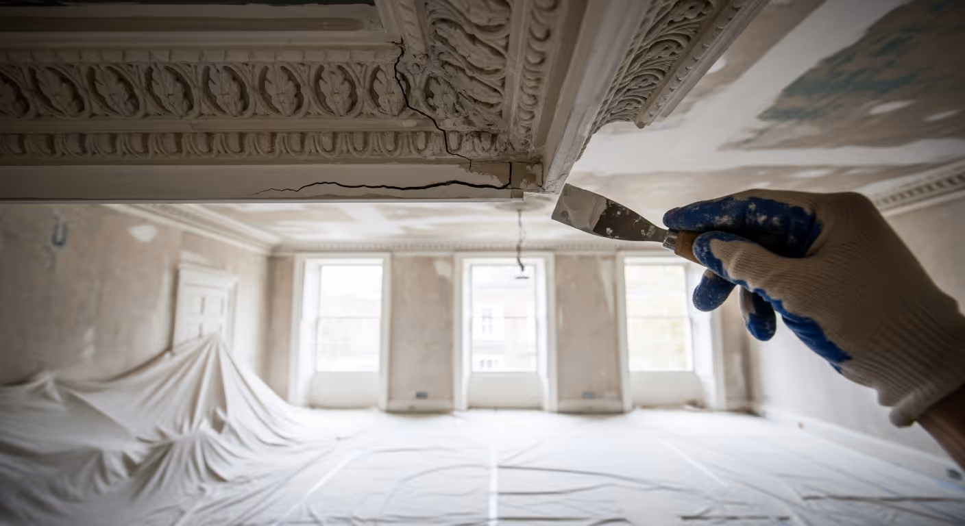
Bedroom walls are often seen in soft side light from table lamps, wall lights, and windows. This kind of light can show old filler patches, nail holes, cracks, sanding marks, and uneven paint texture. A calm colour will not hide poor preparation.
Good preparation usually includes:
This preparation is especially important around the bed wall, because it is often the main view of the room. If that wall holds a headboard, art, or bedside lights, every imperfection becomes more noticeable.

The wall behind the bed usually carries the most visual weight. It may have a headboard, artwork, wall lights, or bedside tables. Even if it is painted the same colour as the rest of the room, it needs to be finished with extra care.
Before painting the bed wall, check:
Sometimes a painted wall is the best answer. Sometimes a soft wallpaper or textured finish can add depth behind the bed. The right choice depends on the room, but the bed wall should always be planned as the main wall, not treated as an afterthought.
A bedroom wall usually looks best with a calm matt finish. Too much sheen can feel distracting, especially under lamps. A matt finish helps soften the room and reduces glare, which is important in a space designed for rest.
Matt finishes work well because they:
The wall still needs to be prepared properly. Matt paint can be forgiving in terms of light reflection, but it will not hide raised filler, rough sanding, or old paint ridges. A soft finish still needs a sound surface.
Skirting, architraves, doors, shutters, and window boards frame the bedroom. If the trim colour is wrong, the wall colour can look wrong too. A wall that seemed warm and soft can suddenly look dull beside very cold white trim. A pale neutral can look yellow beside trim that is too creamy.
Trim planning should include:
In many Belgravia bedrooms, a softer white or gentle off white looks better than a stark brilliant white. It keeps the scheme refined and avoids harsh contrast.

Many bedroom repaints focus on the walls and leave the ceiling as it is. That can be a mistake. Once the walls are fresh, an older ceiling can look tired. Small cracks, stains, or uneven patches become more obvious.
Ceiling checks should include:
A soft white ceiling often works well in bedrooms, but it should relate to the wall colour and trim. A very cold ceiling white can feel disconnected from warm neutral walls. In some rooms, a slightly softened white is more elegant.
Bedroom paint should not be chosen alone. Curtains, carpet, rugs, upholstery, bedding, and headboards all influence how the colour feels. A paint colour that looks perfect on an empty wall can feel wrong once placed beside a patterned curtain or warm timber bedside table.
Before choosing the final colour, look at samples beside:
The paint should support these pieces. It does not need to match them exactly. It simply needs to sit comfortably in the same world.
Some Belgravia bedrooms need more depth than standard paint can give, but less pattern than wallpaper. In that case, Bauwerk limewash can be a good option. It brings soft movement and a mineral feel to the walls, which can work beautifully in a calm bedroom.
Limewash may be worth considering when:
Standard paint may be better if the room needs easier cleaning, a very uniform finish, or simpler future touch ups. The choice should be based on how the room is used, not only on how the finish looks in photos.
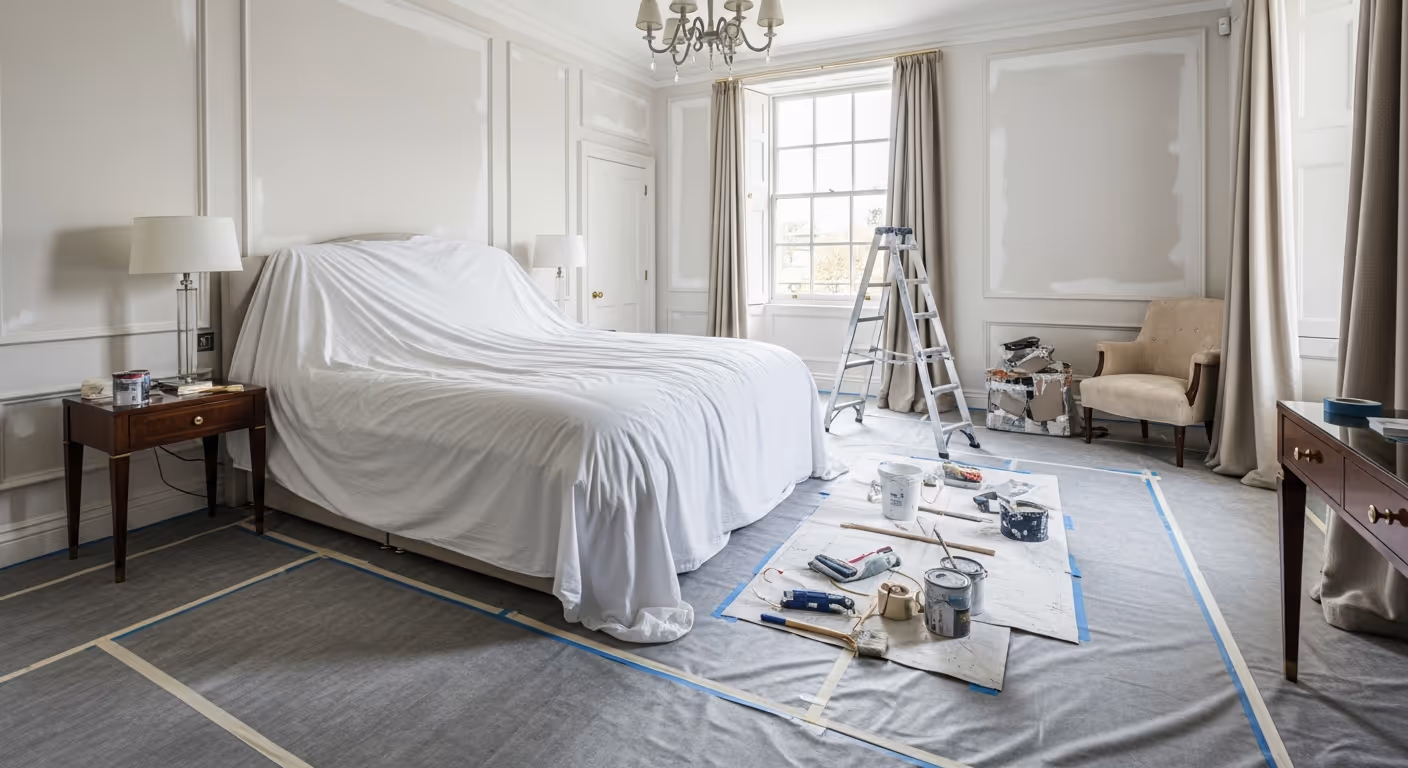
A bedroom repaint should be planned so the room is protected and the work feels organised. This is especially important if the home is occupied during the project.
A typical sequence includes:
The final check matters. Bedrooms change a lot between day and night. A room that looks perfect at noon should also feel right under bedside lamps.
Most bedroom repaint problems come from choosing too quickly. A calm, high end result needs patience at the sample and preparation stage.
What paint colour is best for a Belgravia bedroom? Soft warm neutrals, stone tones, putty shades, and warm off whites are often the safest choices. The right colour depends on the light, fabrics, flooring, and how the room is used.
Should bedroom walls be matt? Usually yes. A matt finish keeps the room soft and reduces glare from lamps and daylight. It is often the most elegant choice for bedrooms.
Should the ceiling be the same white as the trim? It can be, but it does not have to be. A softer ceiling white may work better if the trim is also softened and the walls are warm.
Can I use a darker colour in a small bedroom? Yes, if the room has good lighting and the colour is muted. A deeper tone can make a small bedroom feel cosy rather than cramped when planned well.
We carry out interior painting and decorating across Prime Central London, including Belgravia, Chelsea, Kensington, Notting Hill, Knightsbridge, and Westminster. Many of these projects involve bedrooms, dressing rooms, reception rooms, studies, and period interiors where colour, preparation, and finish quality matter.
Planning a bedroom repaint in your Belgravia home? Send a few photos of the room, including the windows, bed wall, ceiling, trim, fabrics, and flooring. We can help assess the preparation needed, advise on colour and finish, and plan a calm repaint that makes the bedroom feel refined in both daylight and evening light. To begin, request a site visit and we will arrange a time that suits you.
Tell us a few details about your project and our team will review the enquiry and come back to you within one working day.