.avif)
Choosing an exterior colour for a Westminster period home can feel risky. This guide explains how to pick a colour that suits the street, works with stucco and brick, and stays looking sharp in London weather, with a simple plan to avoid costly repaint regrets.
.avif)
Short answer: The best exterior colours for Westminster period homes are the ones that respect the building style, sit well with stucco or brick, and look steady in London light and weather. Start with the street context, then test a small set of related tones on the actual facade. A careful prep and breathable system matter as much as the colour. If you want support from survey to finish, see our exterior and heritage painting service.
Exterior colour choices feel personal, yet they are never made in a vacuum. In Westminster, the building sits in a wider story, terraces, cornices, railings, steps, and the rhythm of a street. A colour that looks perfect on a chart can feel wrong once it meets your stucco, your ironwork, and your light. A colour that looks “safe” can still look flat or dirty after a winter of rain and traffic dust.
This guide gives a practical way to choose exterior colours for a Westminster period home. It covers what works on stucco, what works on brick, how railings change the whole look, and how to test colour properly so you do not repaint twice.
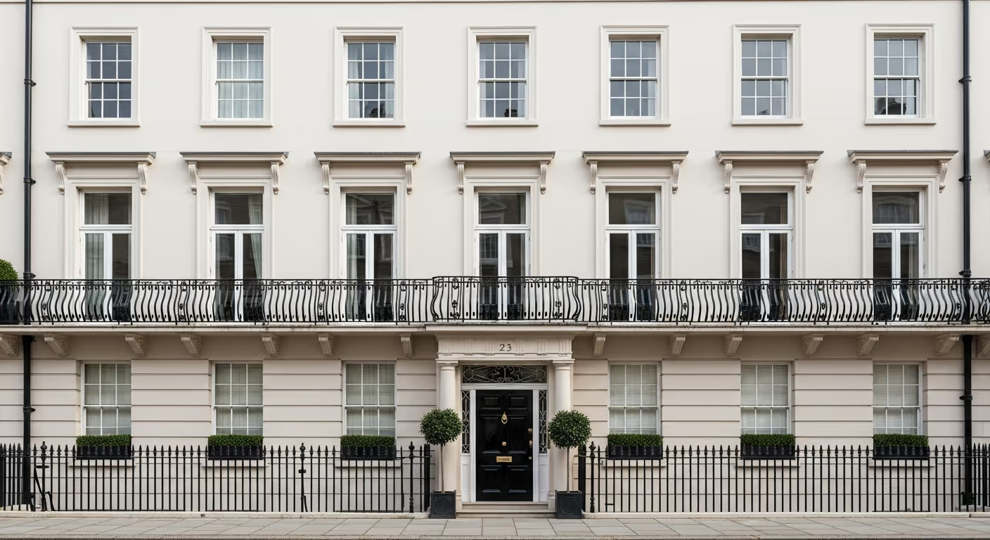
Step back and look at your elevation in context. Westminster streets often have a strong visual line. Even when each owner has made changes over the years, there is usually a shared tone. That does not mean every house must match. It means your home should sit comfortably in the line.
On many streets you will notice patterns such as:
If the terrace feels calm as a whole, choosing an extreme colour can look out of place. If the street already has variety, you may have more freedom. This street view step is also useful for designers and homeowners who want a quiet luxury look, not a “new build bright” finish.
Westminster period homes often combine materials. The main facade may be stucco, the side return may be brick, and details may be stone. Each material reads colour differently.
This is one reason a small test on the actual facade is more valuable than a showroom card. The building materials will change the colour more than you expect.
Many repaint regrets come from trying to pick the “one perfect colour” right away. A better approach is to choose a family, then refine it.
Here are colour families that often work well on Westminster exteriors:
Once you have a family, choose two or three nearby shades rather than jumping between very different options. This keeps the decision calm and makes testing easier.
Iron railings, gates, and balcony details play a huge role in Prime Central London streets. They frame the facade, and they often sit in strong contrast to stucco.
A few simple rules help:
Metalwork finish choice matters too. A satin or soft sheen on railings can feel refined. High gloss can look sharp, yet it also shows defects more clearly and can feel too shiny on some streets.
.avif)
Colour is only part of the story. The finish, meaning sheen level and the paint system, changes how the colour reads. Many period facades look best with a softer finish that does not glare in sun or street lighting.
On heritage stucco and render, breathable systems are often the right direction, since older walls need to release moisture. A dense coating can trap moisture and create blisters or peeling later. This is part of why we treat exterior repaints as protection work, not just a cosmetic refresh. You can read more about our approach on the exterior and heritage painting page.
If you take only one thing from this guide, let it be this. Test on the actual wall. London light shifts, and a Westminster facade rarely reads like a flat interior sample board.
A good test plan looks like this:
Pay attention to what the colour does in shade. Many Westminster streets have tall buildings, so the facade may sit in shade for much of the day. A colour that looks perfect in bright sun can look dull in shade, or it can look too cold.
.avif)
Two issues show up again and again on London exteriors.
Very bright whites can look harsh on stucco, and they can show dirt quickly. On a busy Westminster street, traffic dust and rain marks can make a pure white look tired faster than a softer off white.
Cool greys can look flat or slightly dirty in shade, especially on textured render. A grey with a hint of warmth often reads better on period details.
The sweet spot is often a warm off white or stone tone that looks clean, yet not clinical.
Even when the facade stays classic, the door is a place to add character. Westminster doors often look best in deeper tones that feel grounded against pale stucco.
Door colours that tend to work well:
Door furniture matters. Brass can add warmth. Chrome feels cooler. If the street has a strong style, it often pays to keep the door hardware aligned with that style.
Many Westminster properties sit in conservation areas, and some are listed. Rules can affect colour choices, finishes, and even repair methods. It is always safer to check early than to repaint and then discover a problem later.
If you are not sure what applies to your property, a survey can help you plan the work in a way that respects the building and avoids delays.
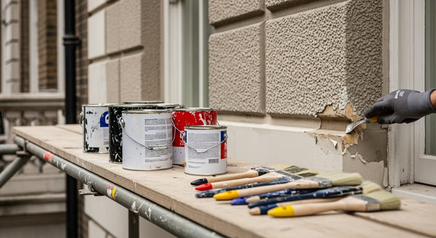
Even the best colour will look average if the base is poor. Period facades often have fine cracks, failed past repairs, and areas where old paint has built up. These details show more once a fresh coat goes on.
Our prep work often includes:
A good repaint should make the facade look calm from the pavement. That calm look comes from prep as much as from colour choice.
Many owners plan exterior and interior updates in the same year. A simple link between them can make the home feel considered from the street to the hallway.
Easy ways to link inside and out:
If your interiors use calm finishes such as Bauwerk limewash, the exterior colour can still relate through warmth and undertone. If you want a full plan that links rooms and elevations, our interior painting and decorating service can support the interior side of the scheme.
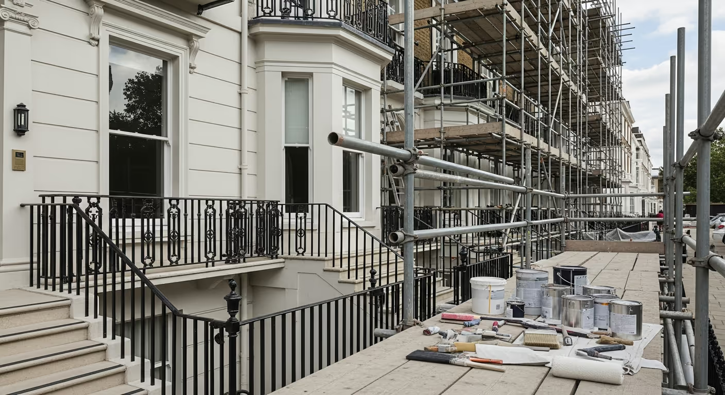
Exterior repainting in Westminster has extra moving parts. Access, scaffold, weather, and neighbours all play a role.
In practice:
A clear plan at the start keeps the work calm. It also keeps the street experience respectful, which matters in Prime Central London.
We carry out exterior and heritage painting across Prime Central London, with frequent work in Westminster, Kensington, Chelsea, Belgravia, Notting Hill, and Knightsbridge. You can also view the finish level we aim for through our projects, including period homes such as the West London period home.
Want help choosing an exterior colour for a Westminster period home? Share a few photos of the elevation, plus notes on street setting, shade, and any colours you like. We can advise a small set of suitable tones and a clean test plan, then carry out the repaint with the right prep and system for a long lasting result. To begin, you can request a site visit and we will set a time that works for you.


