Choosing a front door colour for a Kensington or Chelsea townhouse sounds simple, but the wrong tone can make the whole exterior feel off. This guide explains how to choose a door colour that suits the facade, works with railings and stone, and still feels elegant years from now.
Short answer: The best front door colours for Kensington and Chelsea townhouses usually sit within a classic, restrained palette. Deep greens, deep blues, near black tones, and warm dark greys tend to work well because they anchor pale stucco and pair naturally with railings and stone. The safest way to choose is to test the colour on the actual door, check it in daylight and shade, and make sure it relates to the rest of the facade rather than standing apart from it. For help planning and delivering the full exterior finish, see our exterior and heritage painting service.
A front door is a small part of the facade, yet it carries a lot of visual weight. On a Kensington or Chelsea townhouse, the front door is often the one place where a little personality is welcome. The rest of the exterior may stay classic and quiet, but the door can introduce depth and character. The problem is that door colours are easy to get wrong. A shade that feels rich on a sample card can look flat against pale stucco. A trendy colour can feel dated much faster than the rest of the house.
This guide explains how to choose a front door colour that feels right for a Prime Central London townhouse. It covers what works with stucco, ironwork, and stone, how the street context affects the decision, and how to test colours properly so the result feels elegant rather than risky.
The front door is the closest part of the exterior that most people see. It is where guests pause, where hardware is handled, and where colour is experienced from a short distance. Even when the facade is large, the eye often lands on the door first because it sits at ground level and creates a natural focal point.
In a Kensington or Chelsea townhouse, the front door often does three jobs at once:
That is why a good door colour can lift the whole frontage, while a weak or mismatched colour can make the entrance feel less considered.
Before you think about greens or blues or greys, look at what is already there. The door colour should work with the house, not sit beside it like a separate idea.
Key things to notice first:
Once you know the character of those fixed elements, the colour choice becomes much easier. The door should feel like it belongs to the entrance, not like it was chosen in isolation.
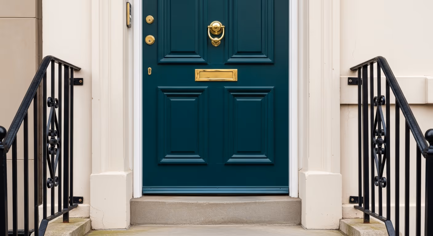
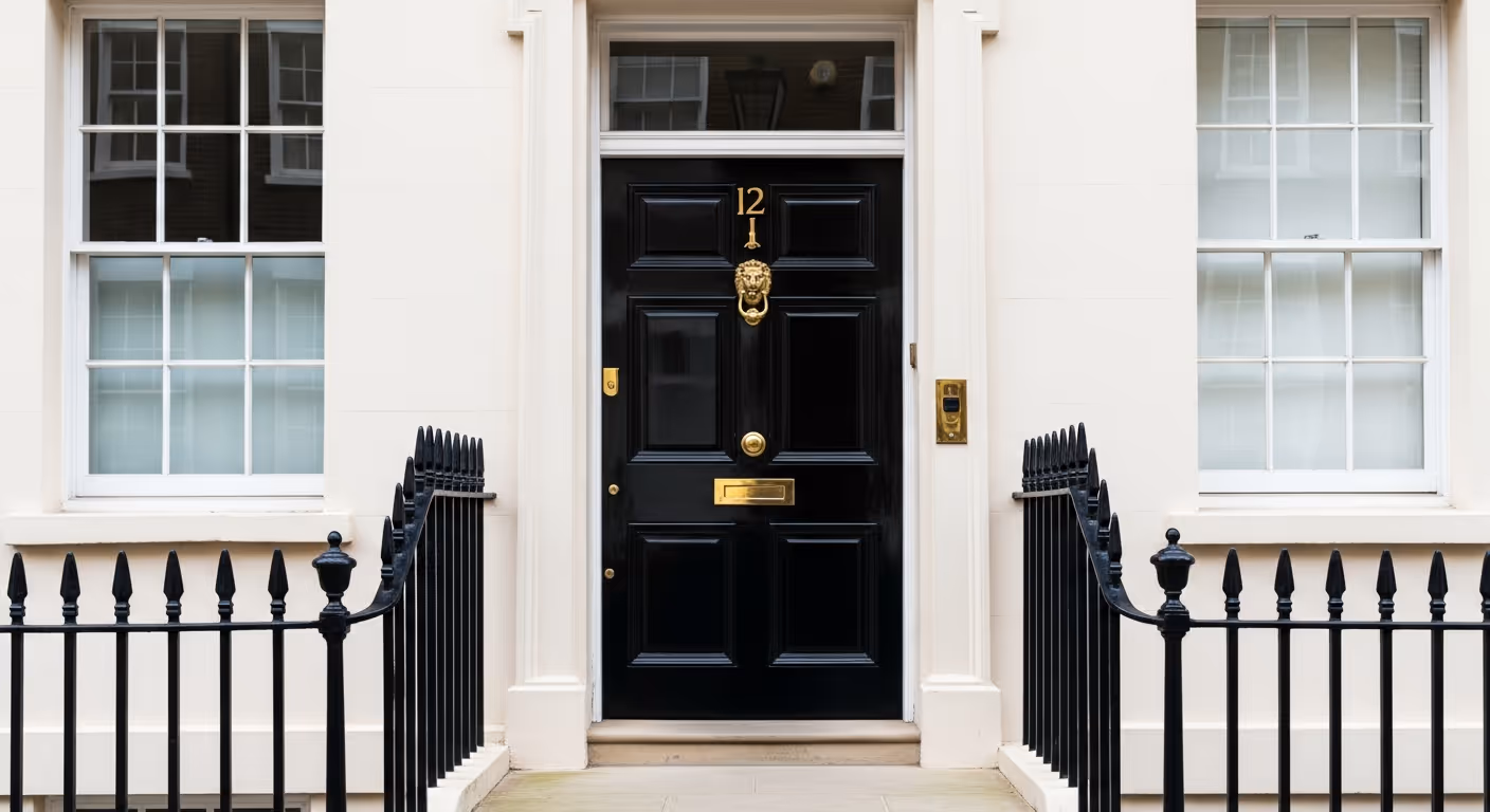
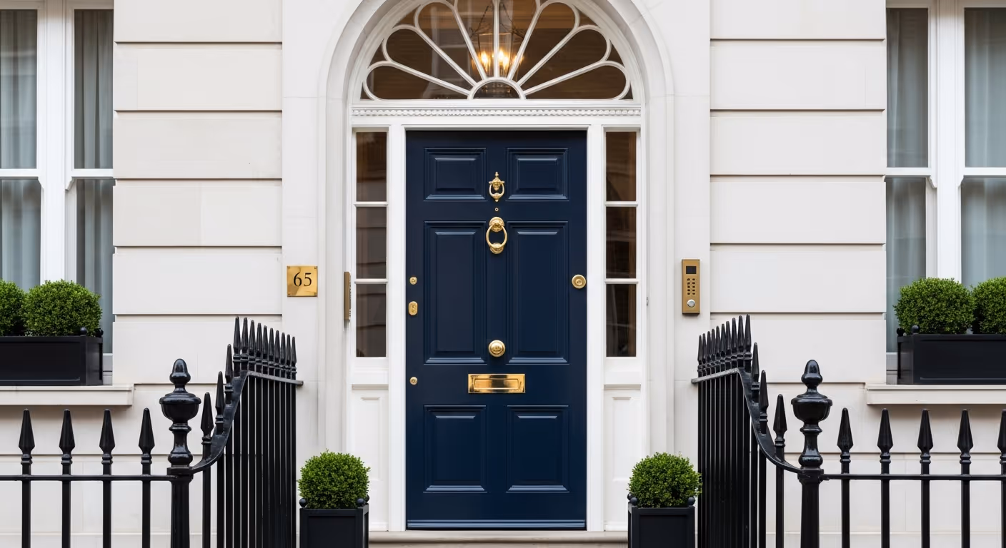
Front doors in Kensington and Chelsea usually look best when the colour has enough depth to feel grounded. Mid strength colours can sometimes feel uncertain against strong architectural detailing. Deeper tones tend to look more settled and more timeless.
Colour families that often work well:
These colours work so often because they relate naturally to black railings and pale facades. They also age more gracefully than trend colours that feel exciting for one season and then quickly date the entrance.
Bright doors can be charming in some settings, but in Kensington and Chelsea they need more caution. A very vivid colour can feel out of place on a formal townhouse, especially if the rest of the street is restrained.
Bright colours can work against you because:
This does not mean colour is forbidden. It means that on a classic London townhouse, quieter sophistication usually lasts longer than bold novelty.
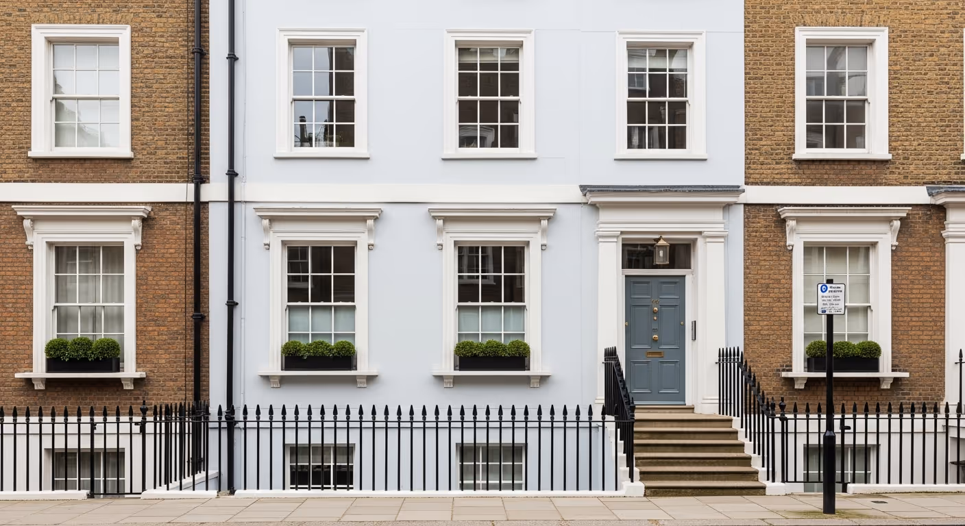
Black or very dark iron railings are one of the strongest visual features of these houses. The front door does not sit on its own. It is framed by the railings, gate, and often a black or dark handrail.
A few simple relationships tend to work well:
If the railings are already strong, the door does not need to compete. It needs to support the whole entrance composition.
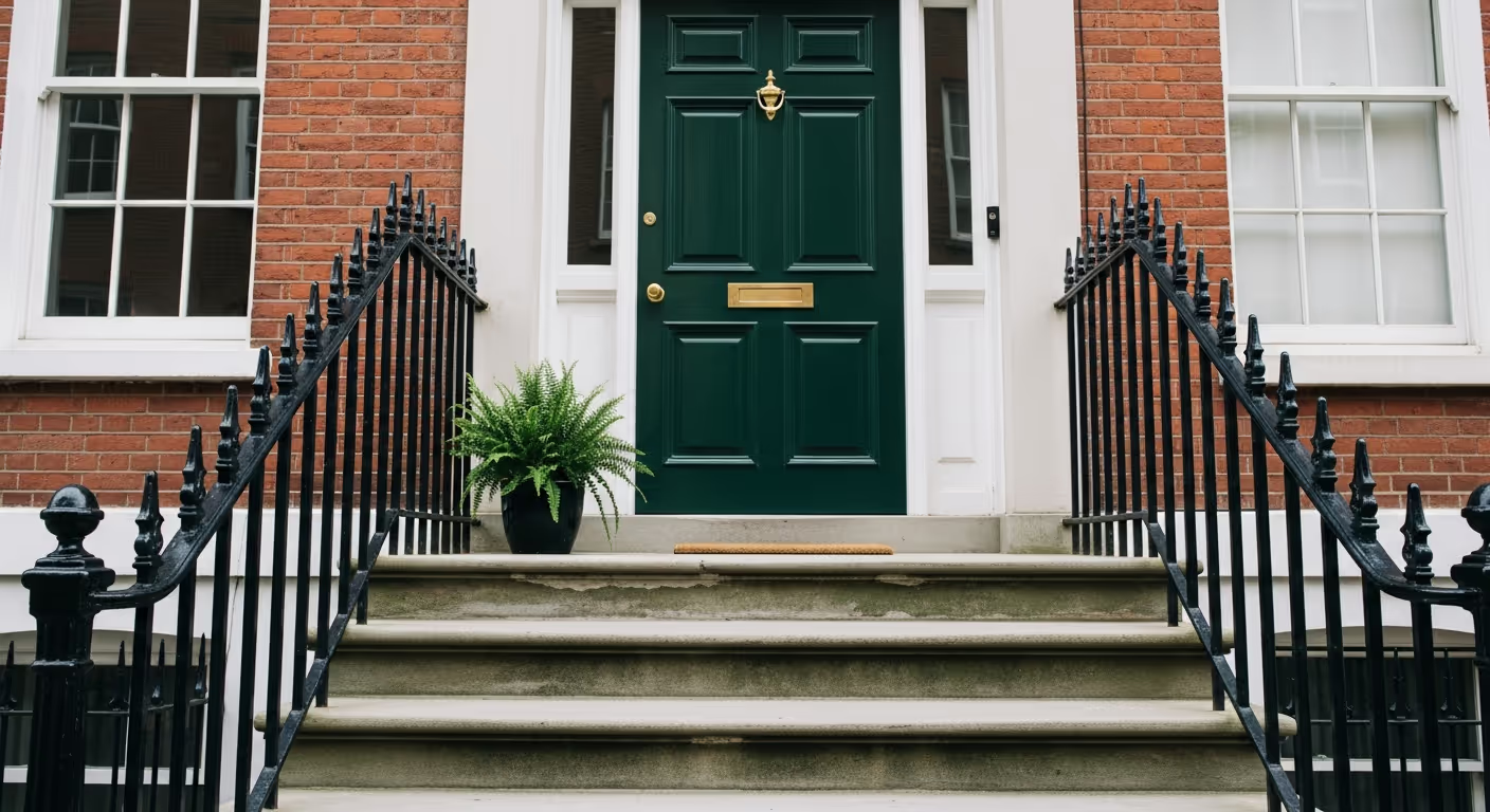
Hardware can push a door colour warmer or cooler. Brass tends to warm a scheme and works beautifully with greens, blues, and dark neutrals. Chrome or polished nickel feels crisper and can make the whole entrance feel cooler and cleaner.
Good pairings often look like this:
If you are already keeping original or established hardware, let that help guide the colour choice rather than fighting it.
A front door does not behave like an interior wall. It sits in outdoor light that shifts quickly. One side of the street may be in bright sun for part of the day and then in shade for the rest. Trees, nearby buildings, and even parked cars can influence how the colour reads.
The safest test process is simple:
A colour that looks perfect at arm’s length may feel too flat or too bright once you see it within the full facade.
Many elegant entrances rely on restraint. The strongest visual impact often comes from one or two well judged elements, not from trying to make everything special at once.
Ways to keep the look refined:
A beautiful entrance usually looks simple when it is right. That simplicity is often the result of very careful choices.
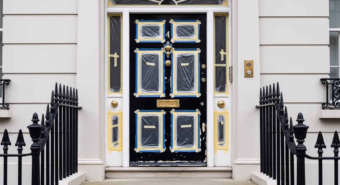
Even the best colour will disappoint if the door and frame are not prepared well. Front doors are used every day. They collect knocks, old paint build, edge wear, and weather stress. A rich dark colour can look superb, but it also makes flaws easier to see.
Before repainting, it helps to check:
A carefully prepared surface makes the colour look more expensive. A rushed surface makes even the perfect colour look average.
There are times when the boldest choice is actually the quieter one. If the facade already has strong details, or if the hardware and stone are very expressive, a calmer door can sometimes be the more elegant route.
Door colours that stay subtle without disappearing:
These can feel especially right on very formal facades where the architecture should lead and the door should support rather than dominate.
Most regret comes from treating the door as a single object instead of part of the whole entrance.
Should the door match the railings? Not exactly. It should relate to them. Deep greens, blues, and dark greys usually do that well.
Is black too harsh for a front door? Not always. It can look excellent, but on some facades a near black or warm dark grey feels a little softer and more expensive.
Does a dark colour make the door look smaller? Not usually in a negative way. On period townhouses, a dark door often feels more grounded and more formal.
Should the inside face match the outside? It can, but it does not have to. The inside face can be planned with the hallway so the transition feels right.
We carry out exterior and heritage painting across Prime Central London, including Kensington, Chelsea, Belgravia, Notting Hill, Knightsbridge, and Westminster. Many of these projects include full facade repainting as well as front doors, railings, and entrance detailing, so the whole frontage feels considered.
Want help choosing the right front door colour for your Kensington or Chelsea townhouse? Send a few photos of the facade, including railings, stone steps, and current hardware. We can help narrow the colour family, plan sensible test patches, and deliver a finish that feels classic and sharp from the pavement. To begin, request a site visit and we will arrange a time that suits you.

Tell us a few details about your project and our team will review the enquiry and come back to you within one working day.