Repainting a Notting Hill home sounds simple until each room starts pulling in a different direction. This guide explains how to plan colours, finishes, and transitions so the whole house feels calm, coherent, and high end from floor to floor.
Short answer: The best way to plan an interior repaint in a Notting Hill home is to build the scheme as a whole, not room by room in isolation. Start with one colour family, choose how light or deep each room should feel, keep trim consistent, and let the finish level follow the way each space is used. That is how the house feels connected instead of patchy. If you want help planning and delivering a full scheme, see our interior painting and decorating service.
One of the most common repaint problems in London homes is not bad colour. It is disconnected colour. A hallway feels one way, the reception room feels unrelated, the bedroom is too cool, and the stair landing feels like it belongs to another house. In Notting Hill homes, where light changes from floor to floor and period features are often strong, this problem shows up quickly.
A good repaint should make the home feel more settled, not more fragmented. That does not mean every room should be the same. It means each room should feel like part of one story. This guide explains how to plan that story in a practical way, using colour family, light, finish, and room function so the whole house feels calm and coherent.
Notting Hill homes often mix strong character with changing light. A single property can include a bright upper floor bedroom, a shaded hallway, a warm reception room, and a lower level room that behaves very differently from the rest of the house.
That creates a few common challenges:
This is why a repaint plan should start with the house as a whole. If you decide each room separately, the scheme can drift very fast.
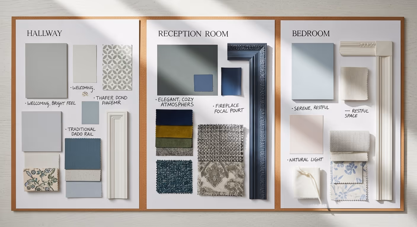
The easiest way to keep a house connected is to choose one colour family first. That does not mean one colour everywhere. It means one shared undertone running through the property.
Good family directions often include:
Once you know the family, you can move lighter or deeper in different rooms without losing the thread that ties the house together.
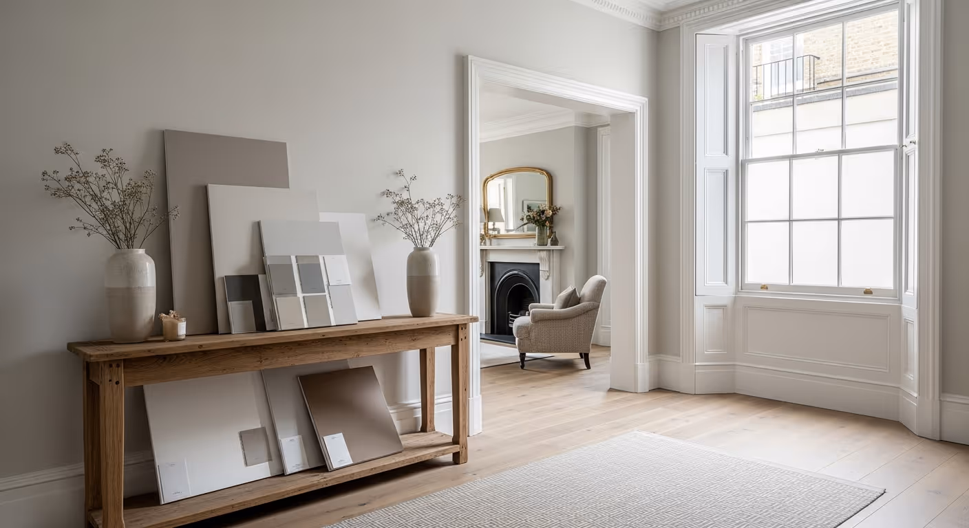
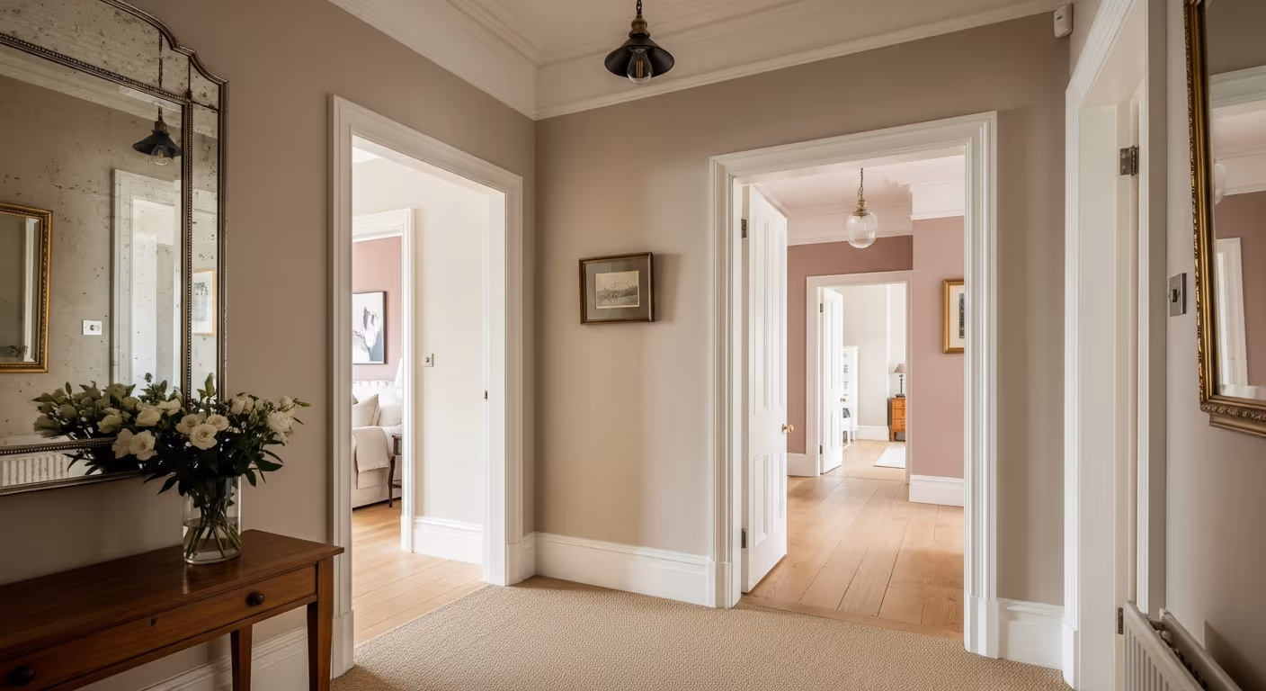
In many townhouses, the hallway and stairs are the connective tissue of the home. They are also the place where disconnected schemes show most clearly. If the hallway works, the whole house often feels more coherent.
A strong hallway plan usually means:
Since hallway walls should follow your rule of matt or soft sheen only, this is also a good space to keep finish decisions practical and colour decisions steady.
People often focus on whether a room should be lighter or darker. Just as important is whether it should feel warmer or cooler. A house stays coherent when the temperatures of the colours relate to one another.
For example:
The key is that you should be able to walk from one room to the next without the colour shift feeling abrupt. That is usually a matter of undertone, not only shade depth.
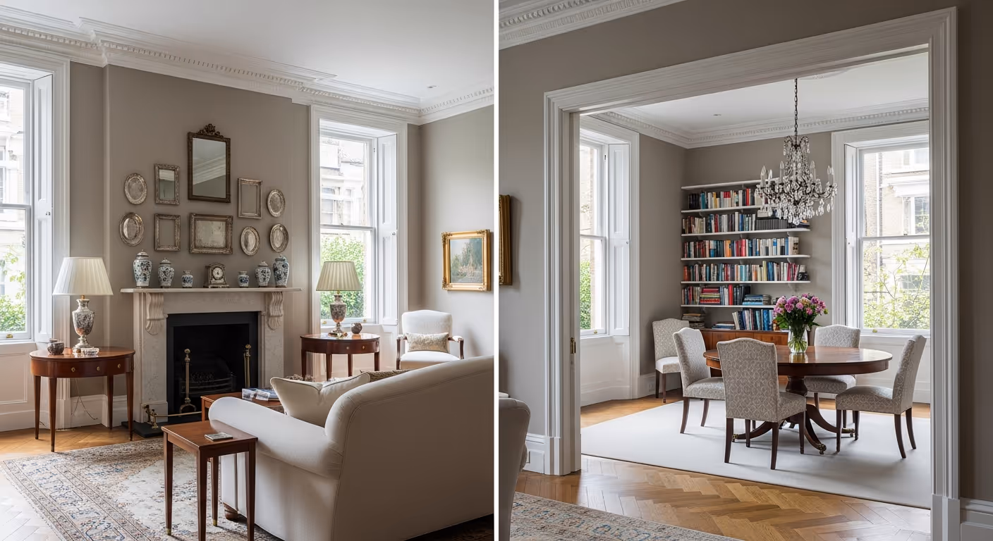
Reception rooms are often the most visible and most connected rooms in a Notting Hill home. If you have two linked spaces, such as a front drawing room and a rear dining room, they should usually be planned together.
You can do this in a few ways:
What matters most is that the rooms feel related from the doorway and from the hallway beyond them.
Bedrooms allow a little more freedom because they are more private. Yet even here, the scheme should still feel related to the rest of the home.
A good rule is:
If you want extra texture in a bedroom, wallpaper or textile wallcoverings can work well on a headboard wall, while the remaining walls stay painted in the same undertone family. That keeps the room special without losing flow.
One of the simplest ways to make a house feel coherent is to keep trim colour consistent. Doors, frames, skirting, shutters, and panelling form the outline of each room. When that outline changes too often, the house can feel unsettled.
Consistency in trim helps because:
You can vary wall tones room to room more confidently when the trim stays steady.
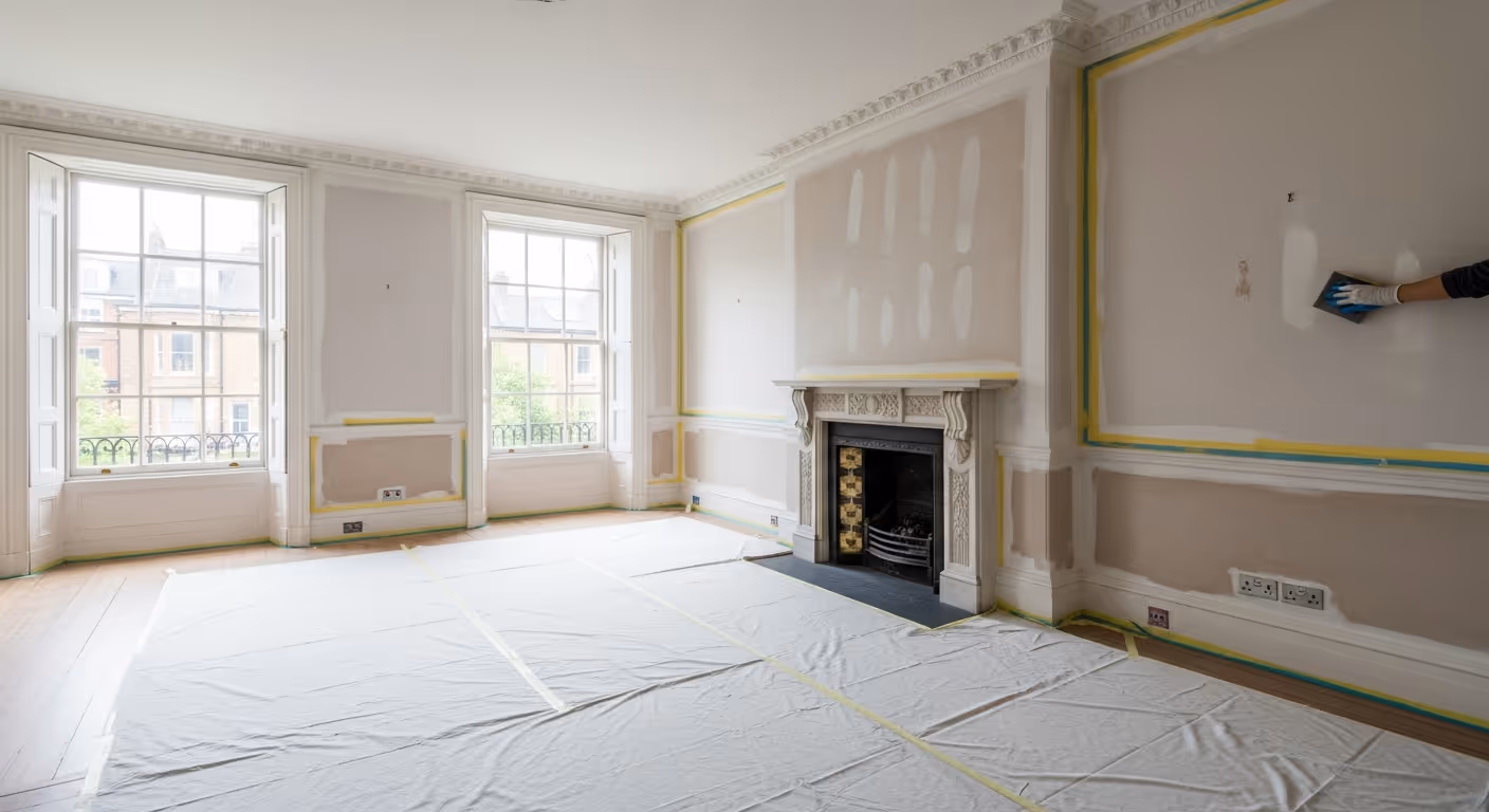
Colour creates mood, but finish affects how practical that mood is. A connected scheme is not only about colour. It is also about using finishes where they make sense.
A practical approach often looks like this:
That way, the house feels coherent visually, but still practical in daily life.
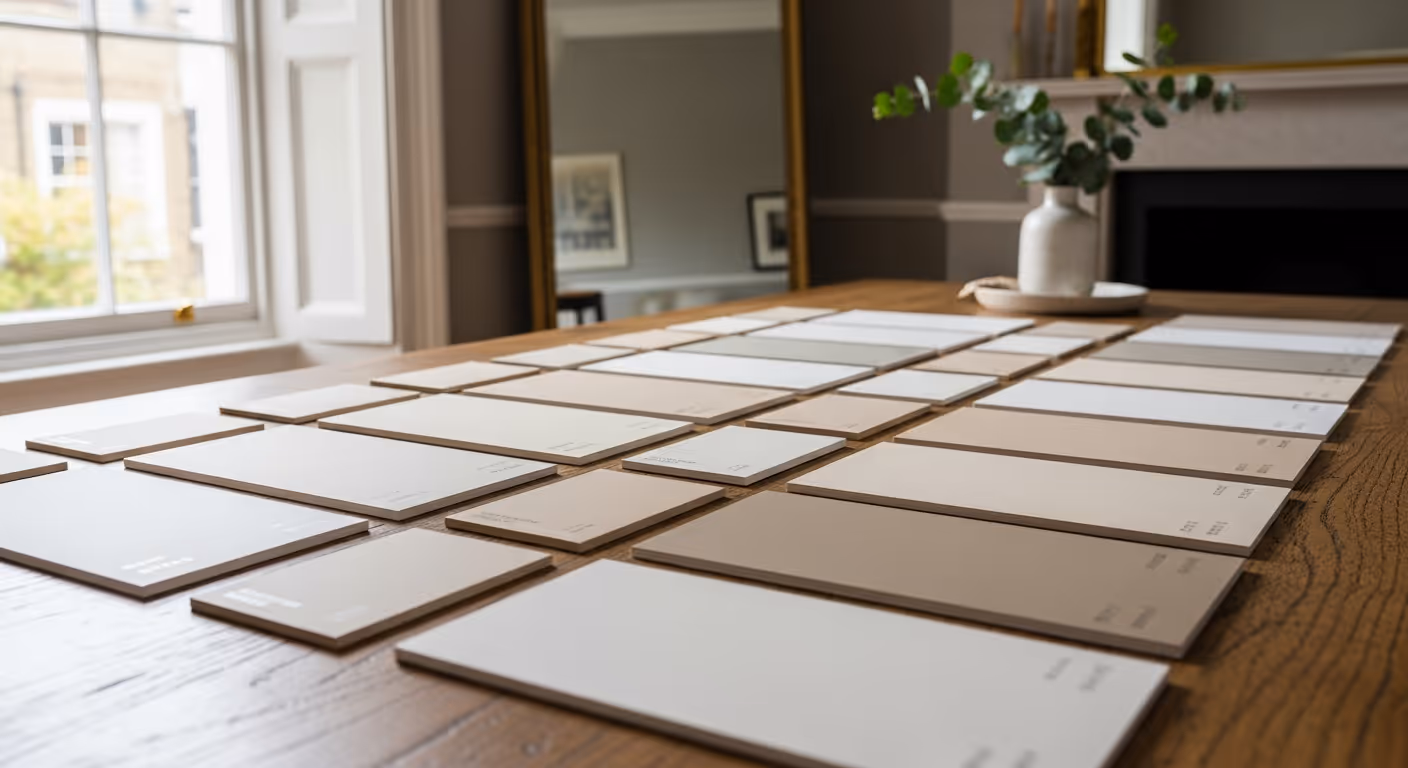
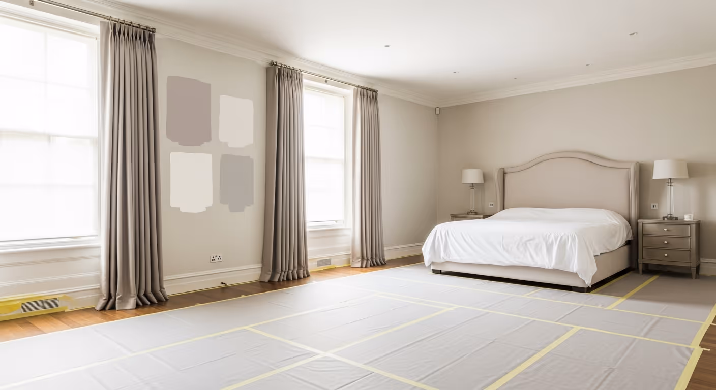
Most sampling goes wrong because people test colours in one room only. If the aim is a connected home, you should compare samples across the transitions that matter.
A better sample process is:
A colour can be beautiful on its own and still be wrong for the house if the transition into the next space feels jarring.
Feature finishes can be a great way to add richness, but they should still fit the overall story.
For example:
The mistake is not using different finishes. The mistake is using them with no colour logic connecting them.
Most of these problems are easy to avoid when the plan starts with the whole house instead of the first room.
If you want a clear and practical way to plan, this model works well for many townhouses.
This keeps the scheme simple enough to control, but flexible enough for the house to have character.
Do all rooms need to match exactly? No. The goal is coherence, not sameness. Rooms should feel related, not identical.
Can one room be darker? Yes, if it still sits in the same family and the transition into it feels intentional.
Should upstairs and downstairs be different? They can be, but usually through depth and mood, not by switching to completely different undertones.
Can I mix wallpaper, paint, and limewash in one home? Yes, very successfully, as long as the undertones connect and each finish is used where it makes sense.
We carry out interior painting and decorating across Prime Central London, including Notting Hill, Kensington, Chelsea, Belgravia, Knightsbridge, and Westminster. Many of these projects involve full home repaint planning where colours, trim, and finishes need to work together from one floor to the next.
Want a connected repaint scheme for your Notting Hill home? Send a few photos of the key rooms and the hallways that link them, plus any colour directions you already like. We can help build a clear scheme that flows room to room and deliver it with tidy prep and clean detailing. To begin, request a site visit and we will arrange a time that suits you.
Tell us a few details about your project and our team will review the enquiry and come back to you within one working day.