Choosing white paint for a Kensington townhouse sounds simple, yet it is one of the easiest ways to get a room wrong. This guide explains warm and cool whites, how they shift in London light, and how to choose a white that feels calm across halls, reception rooms, bedrooms, and trim.
Short answer: The right white for a Kensington townhouse is usually not the brightest white on the chart. It is the white that works with your light, your floors, your trim, and the way the room is used. In many Prime Central London homes, softer warm whites and gentle off whites feel calmer and more expensive than stark whites. The safest way to choose is to test a small group of related whites on your actual walls, then check them morning, afternoon, and evening. For help planning a full interior scheme, see our interior painting and decorating service.
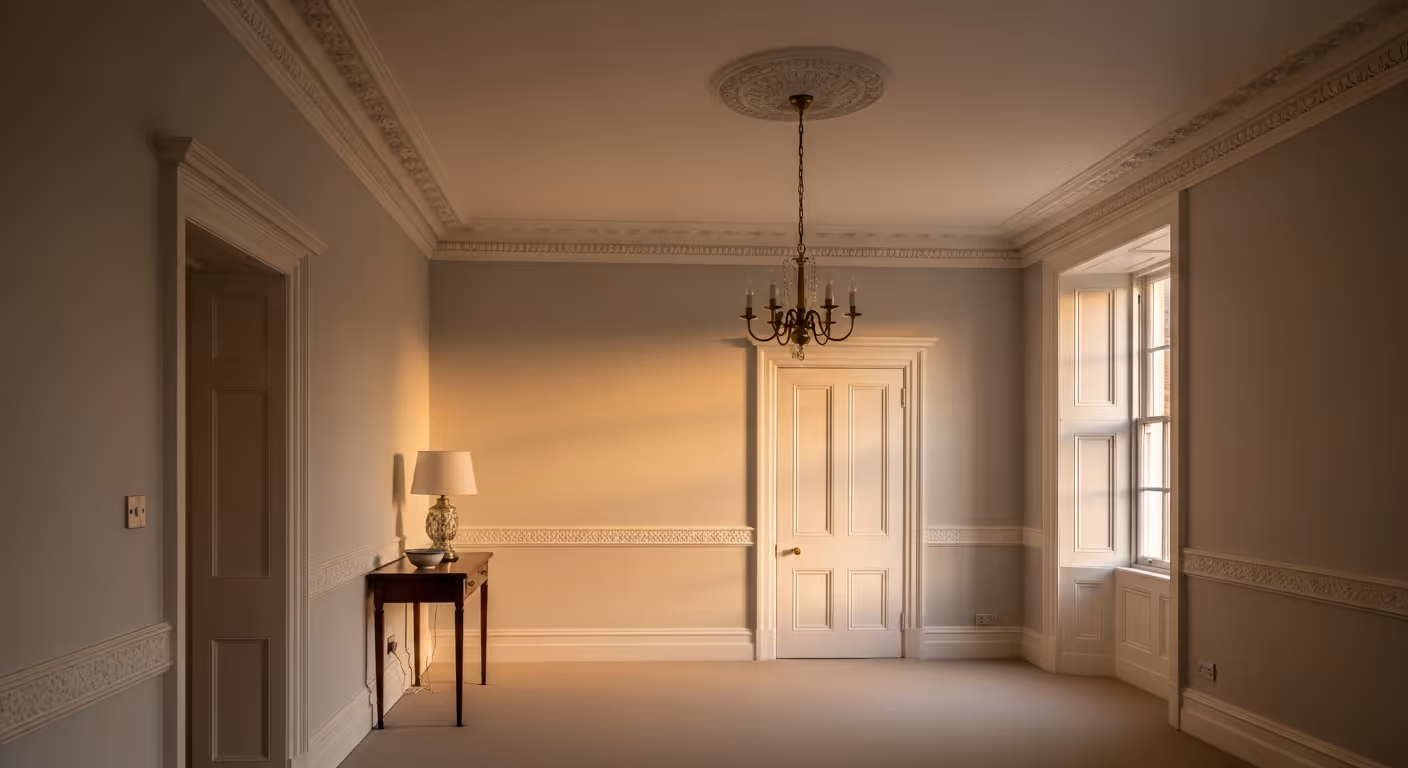
White paint sounds easy until it is on the wall. In a Kensington townhouse, one white can look crisp and elegant in a reception room, then cold and flat in a hallway. Another can look creamy in daylight and suddenly look yellow at night. This is why white is one of the hardest colours to choose well. It reacts strongly to light, and period homes often have a lot of factors that affect it, sash windows, cornices, timber floors, fireplaces, and changing light from floor to floor.
This guide explains how to choose white paint for a Kensington townhouse in a practical way. You will see how undertones work, how different rooms change the look of white, what to test before you commit, and how to keep the whole house feeling coherent instead of slightly different on every floor.
People often treat white as if it has no colour. In reality, every white has an undertone. Some lean warm, some lean cool, some lean slightly green, grey, pink, or yellow. That hidden undertone is what makes the same white look beautiful in one room and wrong in another.
In a Kensington townhouse, these factors make white trickier:
A white that feels fresh in a sunlit top floor bedroom can feel stark in a lower hallway. That is why choosing from a paint card alone rarely works well.
You do not need to memorise paint chemistry. It helps more to think in simple groups.
These are the brightest, sharpest whites. They can look very crisp, but in period homes they can sometimes feel too stark, especially on large wall areas or in cooler light.
These carry a soft yellow, cream, oat, or stone undertone. They often feel more relaxed and live more comfortably with timber floors and traditional details.
These are whites with a soft grey undertone. They can feel refined and modern, but in north facing rooms they can turn cold or dull if you are not careful.
These sit just away from white. They often work beautifully in Kensington homes because they soften the room without obviously reading as cream.
The best result often comes from choosing the white family first, then narrowing down the exact shade.
North facing rooms tend to pull whites cooler. In a Kensington reception room or bedroom with north light, a very clean white can feel hard and slightly blue. This is why warmer whites often perform better in these rooms.
Good directions for north facing rooms:
If you choose a cool white in a north facing room, it can still work, but it needs careful testing. The risk is that the room may feel flat rather than fresh.
South facing rooms usually have warmer, stronger light. West facing rooms can become very warm later in the day. That means a warm white can sometimes become too creamy, especially at sunset.
In these rooms, you often have more flexibility. You can use:
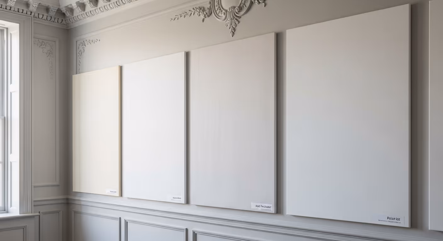
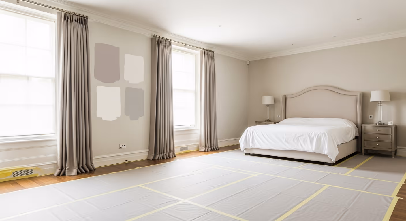
This is where sample boards matter most. A white that seemed perfect in a cooler room can suddenly feel too rich once it catches stronger afternoon light.
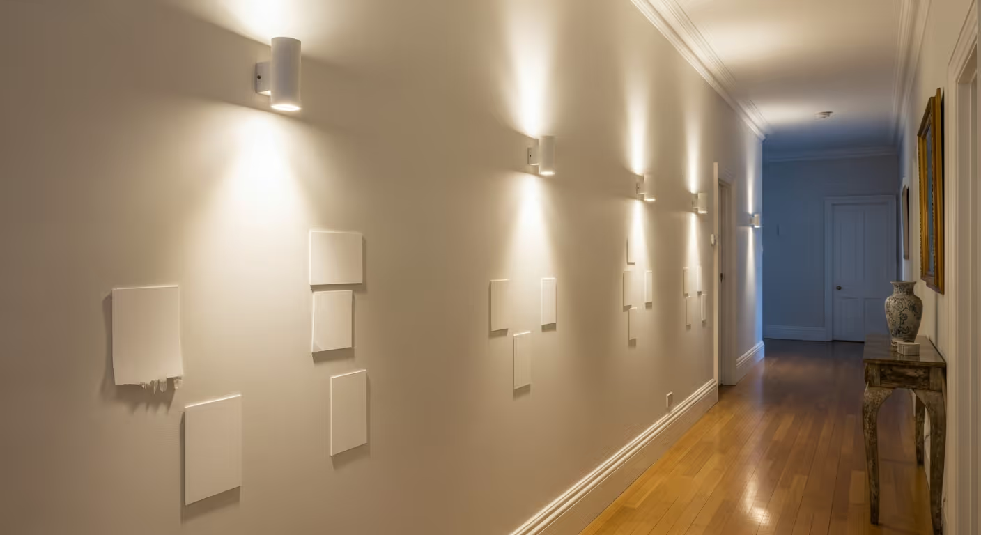
Hallways in Kensington homes are often narrow and used all day. They also connect rooms with very different light conditions. A hallway white should usually be steady, forgiving, and easy to live with.
Hallways often suit:
If you are repainting hallway walls, remember the finish rule remains matt or soft sheen on those walls. The colour choice still matters, but the finish should follow that practical rule.
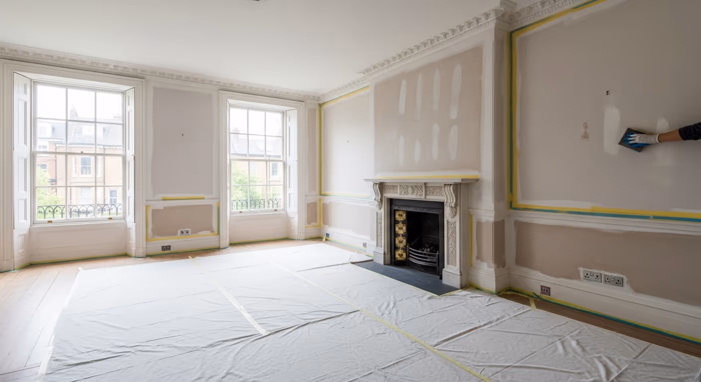
Many owners assume ceilings, walls, and trim should all be one white. That can work, but it is not always the best choice. In period homes, the relationship between walls, ceilings, and trim changes how the room feels.
Common approaches include:
In many Kensington townhouses, using a very sharp white on trim against a softer wall can look elegant, but only if the undertones are compatible. A mismatch is where things go wrong. A warm wall beside a cool trim can feel uncomfortable even when both colours look fine on their own.
White paint does not live on its own. Floors, rugs, curtains, upholstery, and joinery all push it warmer or cooler.
Examples:
This is why you should not choose white in isolation. Hold floor samples, fabrics, or at least photos of the key room elements next to the sample board.
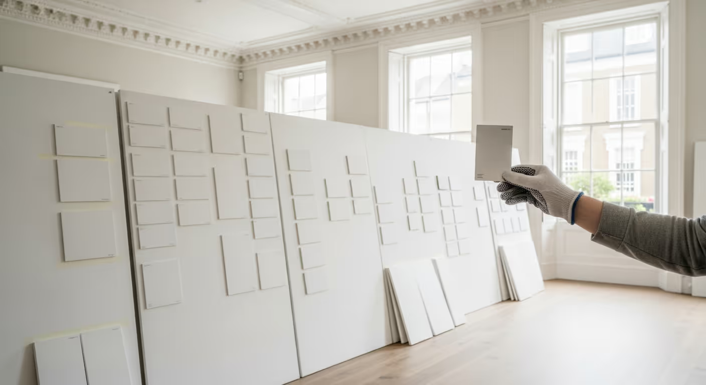
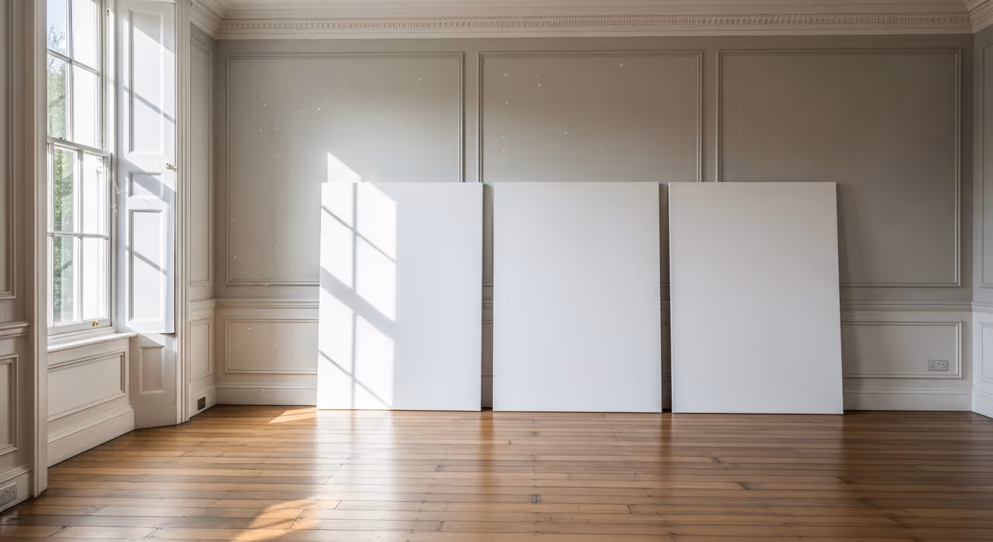
If you take one thing from this guide, let it be this. White must be tested on your walls. The best process is simple.
The doorway test matters because that is how you experience the room as a whole. A white that feels perfect up close may disappear or look too cold from across the room.
Every home is different, but these room by room directions tend to work well in Prime Central London interiors.
Warm whites and chalky off whites often feel most elegant. They support art, cornices, fireplaces, and soft lighting without feeling severe.
Soft, slightly warmer whites often feel best because they connect multiple light conditions and stay welcoming at night.
Bedrooms often suit whites that feel restful and soft. Strong clean whites can feel too bright unless the room is very sunlit and minimal.
A cleaner white can work well if the kitchen has enough natural light and warm materials to balance it. In darker kitchens, a softer off white often feels easier to live with.
These can take a slightly cleaner white if you want freshness, but warm artificial light can still make warm undertones more flattering.
White is popular, but it is not always right. In some rooms, especially those with weak daylight or lots of visual complexity, a soft stone, putty, or very pale neutral can feel much more relaxed.
You may want to step away from white if:
In those cases, a non white neutral can still keep the room calm and elegant. If you want more mineral depth, you might even consider Bauwerk limewash in selected rooms rather than forcing a white that never quite works.
Most white paint disappointment comes from choosing too fast, not from the paint itself.
Should ceilings always be pure white? No. In many period homes, a softer white on ceilings feels more elegant and avoids a harsh contrast with the walls.
Can I use one white throughout the whole house? Yes, sometimes. It works best when the house has similar light conditions or when the chosen white is very balanced. In many townhouses, one family of whites works better than a single exact white everywhere.
Why does my white look yellow at night? Usually because the undertone is warm and your bulbs are warm too. The fix may be a different white, not necessarily a different bulb.
Will white make my room feel bigger? Sometimes, but not always. The wrong white can make a room feel flatter or colder rather than larger.
We carry out interior painting and decorating across Prime Central London, including Kensington, Chelsea, Belgravia, Notting Hill, Knightsbridge, and Westminster. Many of these projects involve full home colour planning where whites, off whites, and trim tones need to work together from floor to floor.
Want help choosing the right white for your Kensington townhouse? Send a few photos of the rooms, note the window direction if you know it, and share any current whites you are considering. We can help narrow the options, plan sensible sample boards, and deliver a finish that feels calm and consistent throughout the home. To begin, request a site visit and we will arrange a time that suits you.

Tell us a few details about your project and our team will review the enquiry and come back to you within one working day.