Want wallpaper in your Knightsbridge dining room but worried it will feel too much? This guide explains pattern scale, texture, colour, lighting, and wall prep, so you get a refined look that still feels calm for everyday use and entertaining.
Short answer: The best wallpaper for a Knightsbridge dining room is usually calm in colour and controlled in pattern. Choose a scale that suits the room size, use texture or tone on tone designs for depth, and invest in wall prep and lining so seams sit quietly in evening light. If you want the room to feel refined rather than busy, keep the wallpaper as the background layer and let lighting, art, and table settings bring the detail. For professional installation, see our wallpaper service.
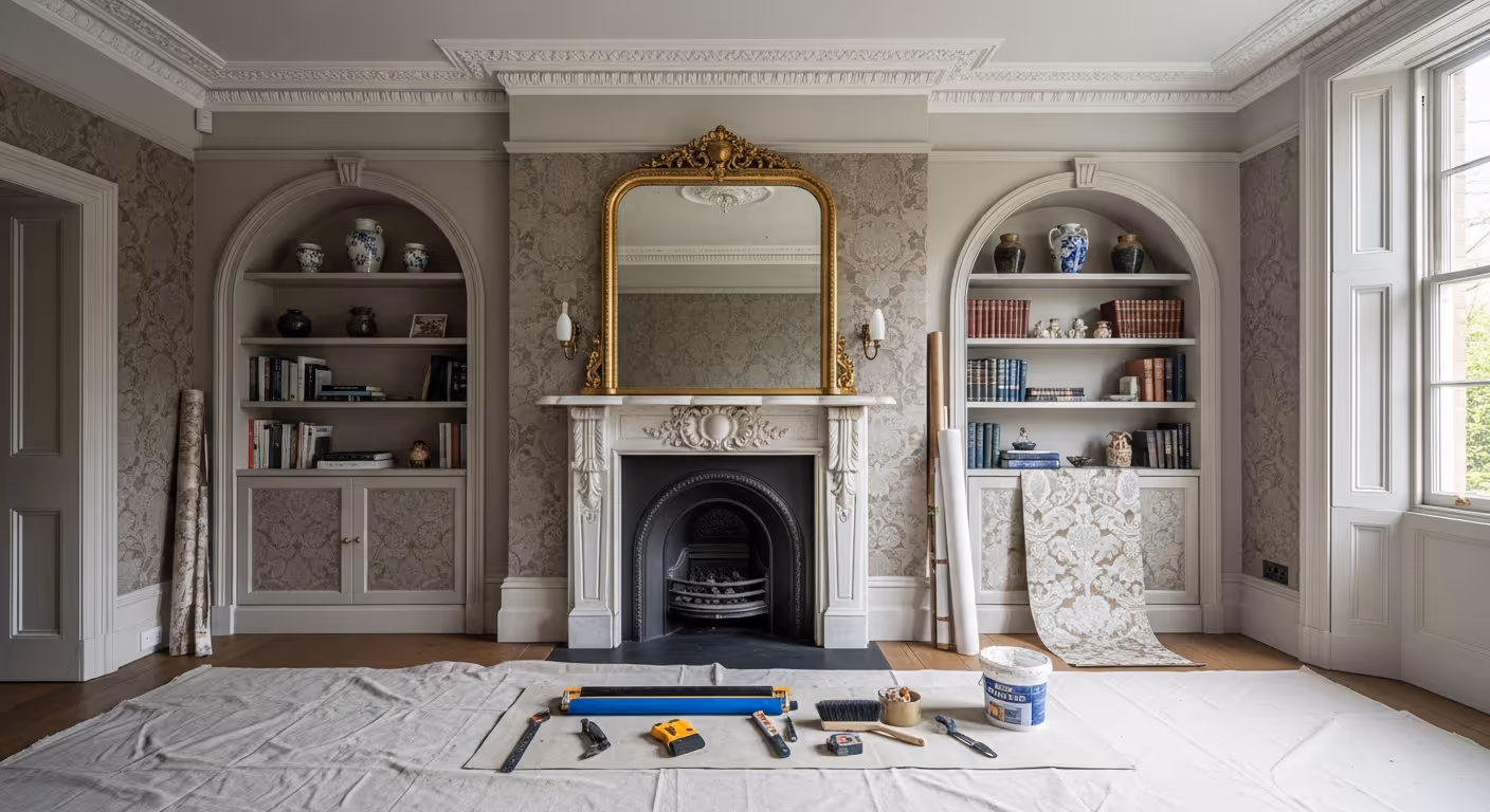
Dining rooms in Knightsbridge often serve two roles. They host dinners and guests, but they also sit quietly on normal days. That is why wallpaper choice matters. A pattern that looks amazing in a showroom can feel noisy once it wraps around four walls. A bold repeat can overpower art. A shiny surface can bounce light in a way that feels harsh at night. Yet the right wallpaper can make a dining room feel finished, warm, and tailored, without turning it into a statement that tires you out.
This guide helps you choose wallpaper for a Knightsbridge dining room in a way that feels calm. We will cover pattern scale, texture, colour undertones, lighting, and the prep work that makes wallpaper look high end in real homes.
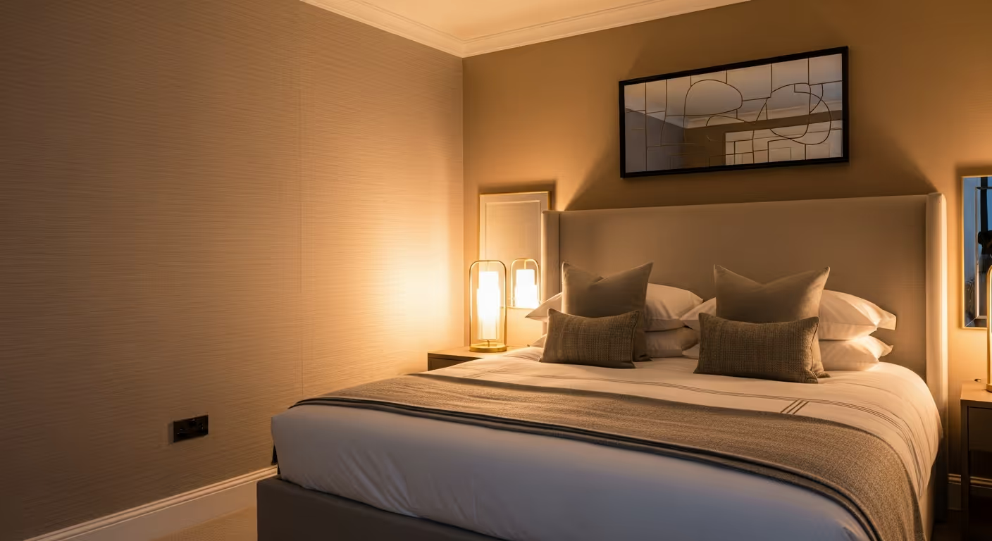
Wallpaper is not only visual. It affects how a room feels. A Knightsbridge dining room often benefits from a mood that supports conversation and soft evening light. Ask yourself what you want the room to feel like at 8pm.
Once the mood is clear, the wallpaper decision becomes easier. You stop chasing what looks impressive and start choosing what fits your daily life.
Most “busy” dining rooms fail on scale. The pattern repeat is either too small and makes the walls feel fussy, or too large and dominates the room.
Simple scale guidance:
If you are unsure, step back from the sample. If the pattern reads clearly from the doorway and starts competing with furniture, it may be too strong. If the pattern disappears completely, you may be paying for something you will not enjoy. A calm dining room often sits in the middle, the walls have depth, but they do not shout.
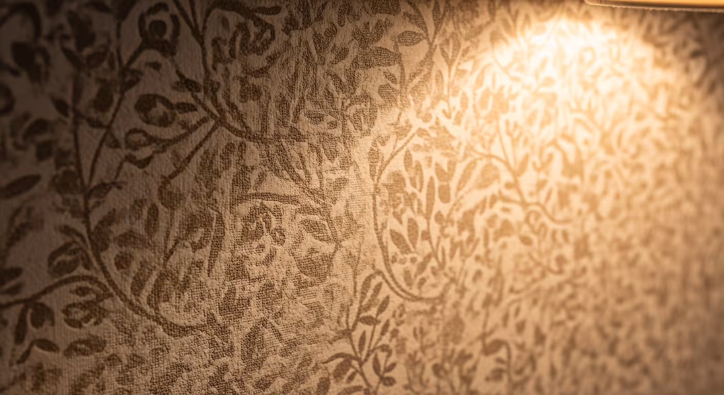
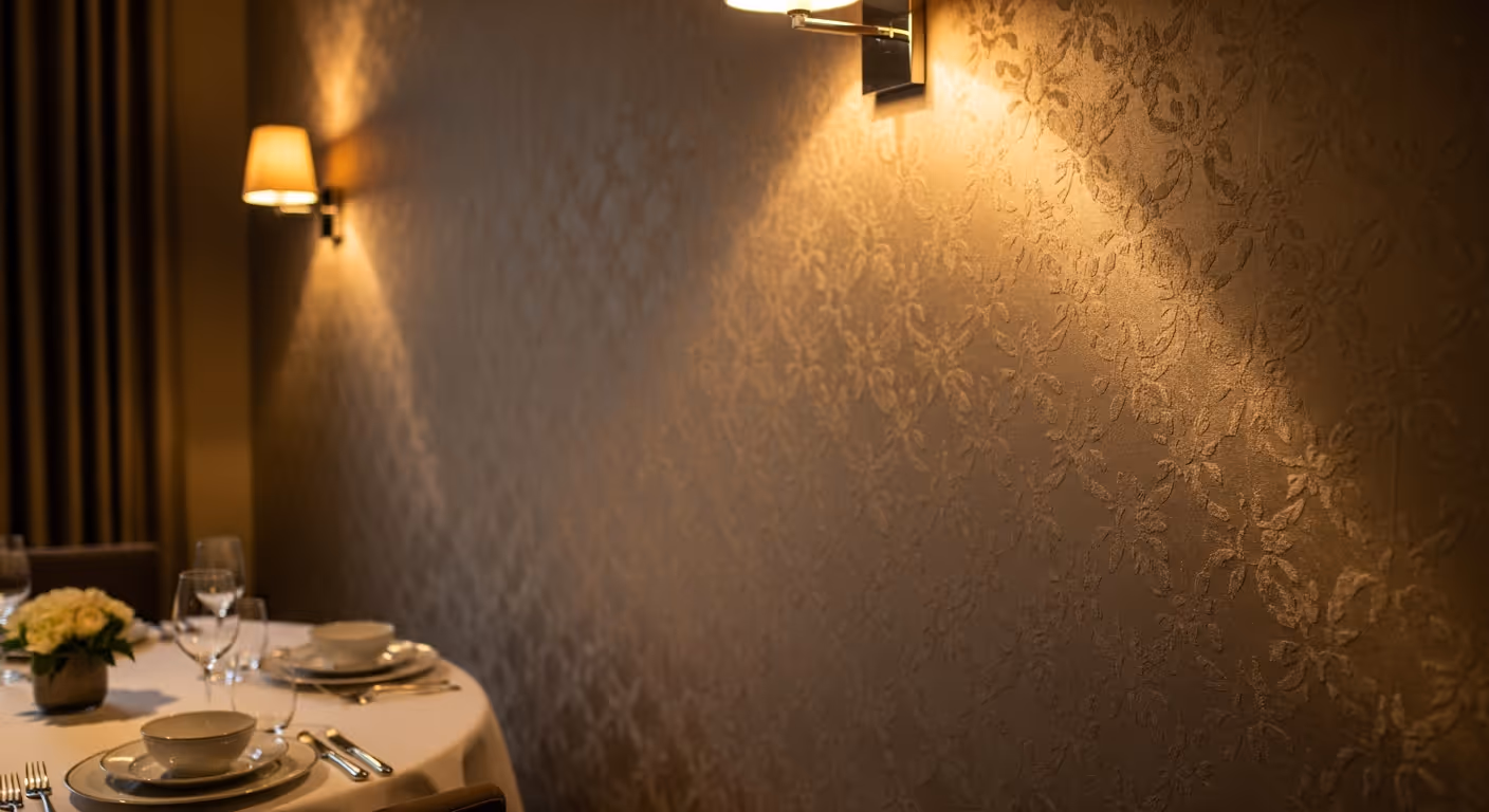
Texture can be more forgiving than bold pattern. In a dining room, texture catches warm light and adds a layered feel. It can also hide minor wall imperfections better than a perfectly smooth paper.
Textured wallpaper styles that often suit Knightsbridge dining rooms:
If you want the room to stay timeless, texture is often the safest path.
Dining rooms are often used in warm artificial light. That can change how a wallpaper colour reads. A neutral can turn yellow. A grey can turn green. A bright white can look stark.
To keep the room flattering at night:
If your dining room links to a hallway, it helps to keep colour families related so the house feels coherent. If hallway walls are painted, remember the rule is matt or soft sheen there, which can still be matched into a similar undertone family.
Many owners assume a feature wall is always calmer. That can be true, but not always. A feature wall can sometimes feel like a loud panel if the wallpaper is bold and the rest of the walls are plain. A full wrap can actually feel calmer when the wallpaper is subtle, because the room reads as one envelope.
Use this simple rule:
If you entertain often and want the room to feel complete, full room wallpaper in a restrained design can be the most refined choice.
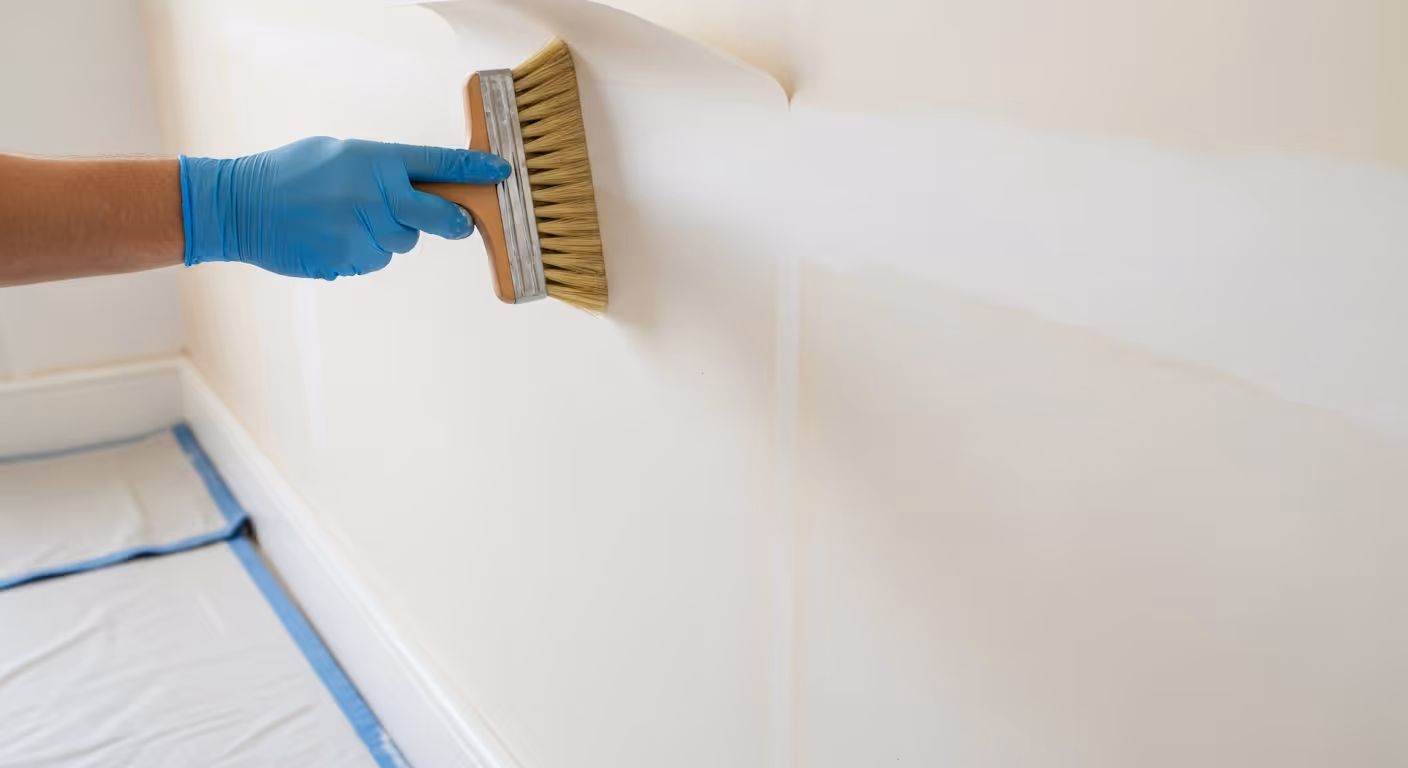
Dining rooms often have wall lights, picture lights, or candles that create side light. Side light is honest. It shows bumps, filler edges, and seams that were not planned well. This is why prep is so important.
A high end wallpaper finish often needs:
Lining is often the hidden hero. It reduces the risk of base wall texture showing through, and it can help seams sit more quietly, especially with heavier papers.
Seams do not have to be obvious. In a dining room, the best seam plan is to place joins where light is softer and where the eye is less likely to pause.
Seam planning tips:
This is one reason professional installation matters. A good installer plans the setting out before any cutting starts.
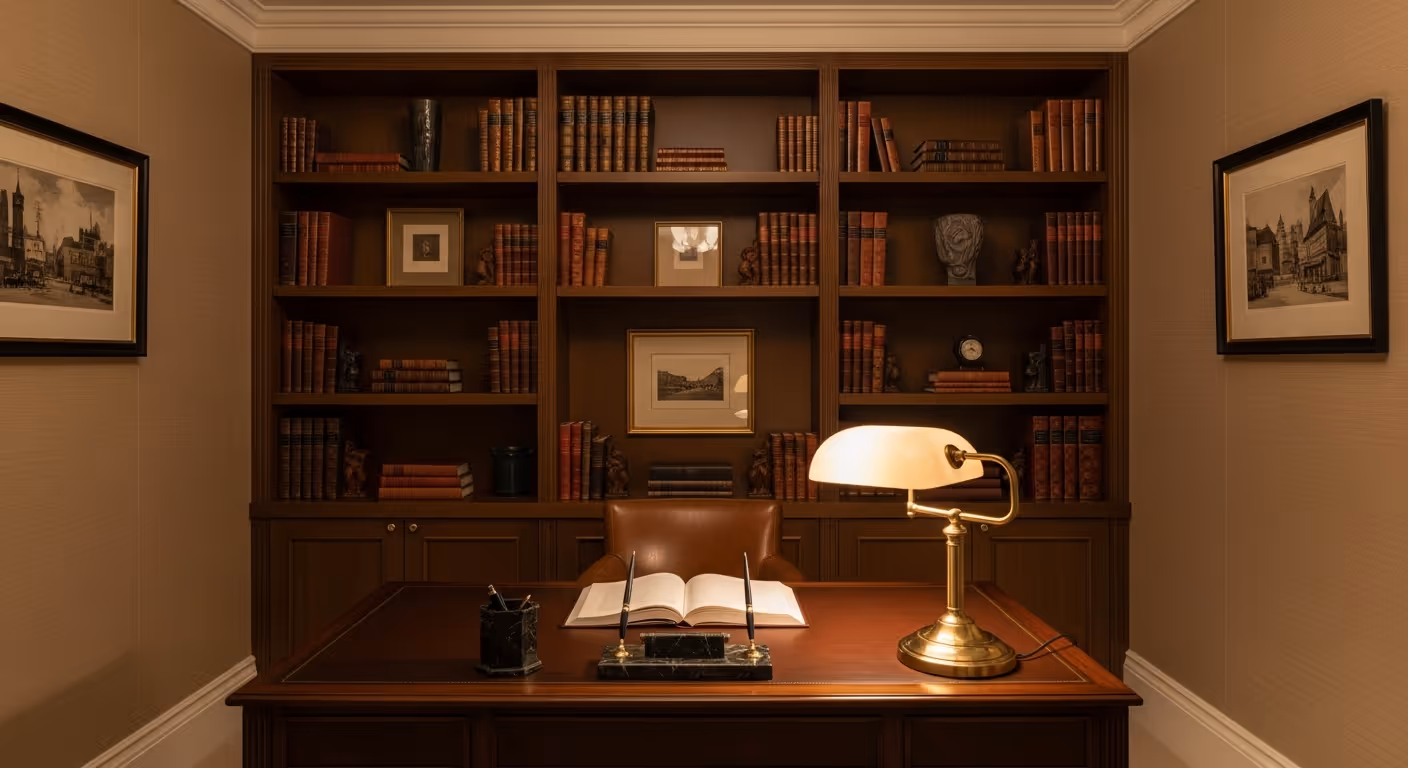
A dining room can look expensive with very little. The key is restraint and consistency.
Ways to keep wallpaper feeling tailored:
If you want the wallpaper to link with a softer finish in nearby rooms, Bauwerk limewash can work beautifully in reception rooms when undertones match. You can view that finish on our Bauwerk limewash page.
Most of these mistakes are easy to avoid. The fix is to test, plan, and keep the wallpaper working as a background layer.
Is wallpaper outdated? No. In Prime Central London homes it is widely used, especially in dining rooms, bedrooms, and powder rooms. The key is choosing designs that feel calm and well installed.
Can wallpaper work with painted panelling? Yes. A common approach is painted lower panelling with wallpaper above. It protects the lower wall and keeps the room refined.
Should I wallpaper the ceiling? It can look striking, but it can also feel heavy in dining rooms. It usually suits very high ceilings and a very calm wallpaper choice.
What if I want an easier finish? Paint can be a smart choice, and we often combine finishes in one scheme through our interior painting and decorating service.
We install wallpaper across Prime Central London, with frequent projects in Knightsbridge, Belgravia, Kensington, Chelsea, Notting Hill, and Westminster. You can view our finish level on our projects page, including spaces such as the Super prime residence.
Want wallpaper that suits a Knightsbridge dining room? Send a few photos of the room, note the lighting types you use most, and share any wallpapers you like. We can advise on scale, texture, and prep, then install the paper with a clean seam plan that keeps the room calm. To begin, request a site visit and we will set a time that suits you.
Tell us a few details about your project and our team will review the enquiry and come back to you within one working day.