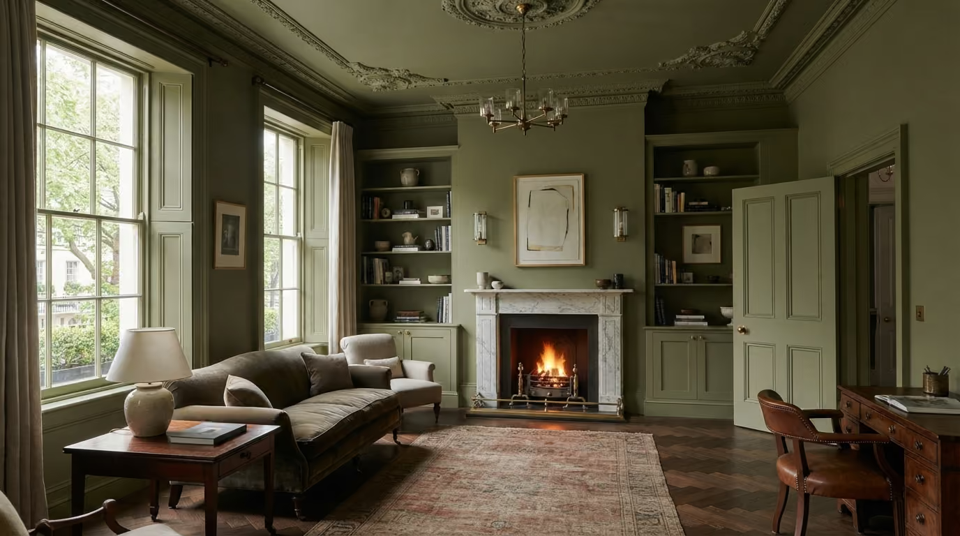
Colour drenching can create a calm, cohesive interior by extending one colour across walls, ceilings, doors, skirting, cornices, and fitted joinery. This guide explains how to choose the right colours, coordinate different paint finishes, preserve period architectural details, and use lighting and subtle sheen variations to achieve a refined result.
The practical answer: Colour drenching can work beautifully in a Belgravia period home, particularly in studies, bedrooms, dining rooms, and reception spaces where a calm, cohesive interior is more important than strong contrast between walls and woodwork. The technique involves using one colour, or closely related tones, across several architectural surfaces, including walls, ceilings, doors, skirting, cornices, and fitted joinery. The secret is not simply painting everything the same colour. It is understanding how the colour behaves in different lighting conditions, which architectural details should remain visible, and where subtle variations in sheen can create depth. For specialist preparation and finishing, see our interior painting and decorating service.
Period interiors in Belgravia often contain an extraordinary amount of architectural detail. Tall doors, decorative cornices, ceiling roses, deep skirting boards, panelled walls, traditional fireplaces, and fitted cabinetry can all appear within a single room.
Traditionally, these features are often separated through colour. The walls might be pale stone, the ceiling white, the skirting another shade of white, and the doors finished in a contrasting neutral.
Colour drenching takes a different approach.
Instead of creating a visible boundary around every architectural element, the room is treated as a more continuous composition. The architecture remains, but its presence is expressed through shape, shadow, texture, and sometimes sheen rather than several contrasting paint colours.
Done well, this can create a sophisticated and surprisingly restful interior. Done without sufficient planning, it can leave a room feeling flat, too dark, or visually disconnected from the rest of the property.
This guide explains how to approach colour drenching in a Belgravia period home, including which rooms suit it, whether ceilings and cornices should match, how to handle doors and skirting, which paint finishes to consider, and how to test colours before committing to the entire room.
Colour drenching generally means extending a chosen colour across several surfaces that would traditionally be painted separately.
For example, a study could have:
The result is more continuous than a conventional scheme with white ceilings and contrasting woodwork.
However, colour drenching does not require every surface to have exactly the same paint formulation or sheen.
Walls, ceilings, and joinery have different practical requirements. The finishes should be selected for their intended surfaces while maintaining the overall colour relationship.
One of the main advantages of colour drenching is that it can make architectural details feel more integrated into the room.
Consider a Belgravia reception room with:
If every element uses a different colour, the eye moves between numerous separate boundaries.
When the main painted surfaces share one colour, those boundaries become less pronounced. The room can feel calmer because the architecture is no longer divided into so many contrasting sections.
The cornice still creates shadows. Door panels still have depth. Skirting retains its profile. Fitted cabinetry remains distinguishable through its form and the way light falls across it.
In other words, matching the colour does not necessarily make the architectural detail disappear.
Colour drenching can work throughout a home, but some spaces particularly benefit from the approach.
A study is often an excellent candidate because it can comfortably support a deeper, more enveloping colour scheme.
Muted olive, tobacco, warm charcoal, deep blue, and brown based neutrals can work well with books, artwork, timber furniture, and traditional lighting.
Painting fitted bookshelves in the same colour as the walls can help them feel like part of the architecture rather than separate furniture.
Bedrooms often benefit from reduced visual contrast.
Using a consistent colour across the walls, doors, skirting, and sometimes the ceiling can make the space feel more settled.
Warm stone, muted mushroom, soft clay, and restrained green tones can create a gentle effect without making the room feel heavily decorated.
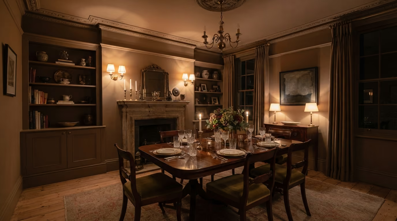
Dining rooms are frequently used under artificial light, which makes them interesting spaces for deeper colours.
A colour drenched dining room can feel particularly atmospheric in the evening, especially when paired with stone, timber, brass, artwork, and carefully planned wall lighting.
Colour drenching can also work in formal reception rooms, although the relationship with the fireplace, artwork, curtains, and natural light becomes especially important.
A large room with several architectural features may benefit from using one continuous colour rather than introducing multiple decorative contrasts.
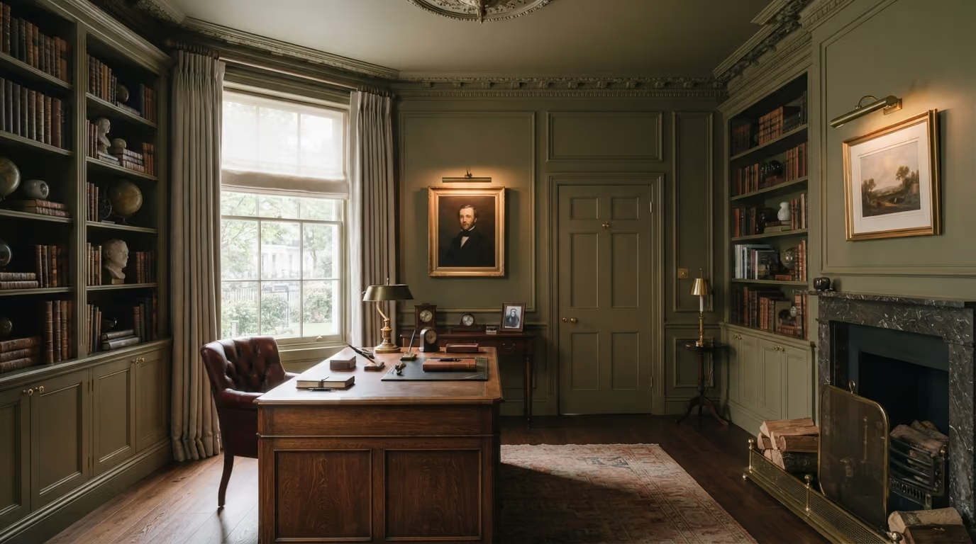
This is often the biggest decision in a colour drenching scheme.
Painting the ceiling in the same colour removes the familiar white boundary at the top of the room.
That can make the space feel more continuous, particularly where the ceiling and walls meet through a substantial cornice.
In a study or bedroom, this can create an especially calm result.
However, the effect depends on several factors:
A pale stone colour across both walls and ceiling can feel gentle and understated. A deep charcoal will create a much more dramatic atmosphere.
Neither approach is automatically better.
The right decision depends on how the room should feel and how it will be used.
Not necessarily.
A contrasting white ceiling creates a clearly defined horizontal boundary. When that contrast is removed, the room may feel more continuous.
However, darker colours also absorb more light, which can make a poorly lit space feel significantly darker.
The actual effect depends on the proportions of the room, the amount of daylight, and the lighting design.
This is why a ceiling colour should never be judged only from a small sample held vertically against a wall.
The sample needs to be considered in relation to the ceiling and under the lighting conditions the finished room will experience.
Period cornices are often painted white to create a strong outline between the walls and ceiling.
Colour drenching removes or reduces that contrast.
This can be particularly effective with detailed plasterwork because the mouldings become visible through their own shadows rather than through a separate colour.
A well proportioned cornice may look surprisingly elegant when painted to match the walls and ceiling.
However, the quality of the preparation becomes important.
Older cornices may contain:
These defects should be assessed before decorating.
Adding another coat without careful preparation can gradually soften the original profiles.
They can.
A ceiling rose painted in the same colour as the ceiling often creates a quieter appearance, particularly when a decorative pendant light is the main focus.
The plaster detail remains visible through shadow and the surrounding light.
Keeping the ceiling rose white is another option, but this creates a separate focal point that may interrupt the more continuous effect of the scheme.
Where a room contains important historic plasterwork, the decision should consider its existing condition and architectural significance.
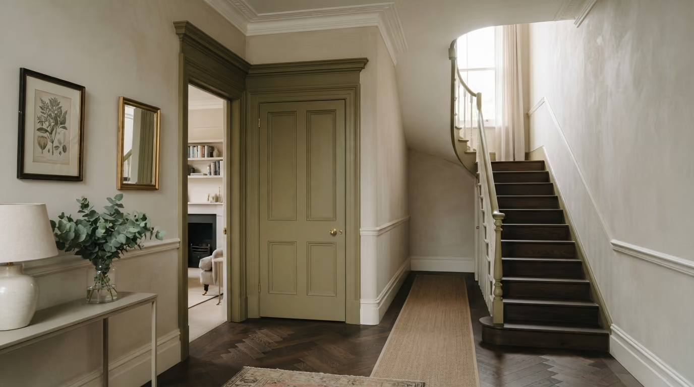
Colour drenching often includes doors, architraves, and skirting because these elements create some of the strongest outlines in a conventionally painted room.
Painting them in the same colour as the walls can make the architecture feel more integrated.
However, their coatings may need to differ.
For example, the walls may use a matt finish while doors and skirting use a suitable eggshell or satinwood finish.
The colour can remain consistent while the different surfaces reflect light slightly differently.
That subtle change in sheen can be useful because it allows doors and skirting to retain definition without introducing another colour.
The same named paint colour can appear different across surfaces with different sheens.
A matt wall absorbs and scatters light differently from painted joinery with a stronger sheen.
As a result, the door may appear slightly lighter, deeper, or more reflective even when both coatings are intended to represent the same colour.
This is not necessarily a problem.
It can provide just enough separation to make the architecture feel defined.
However, samples should be tested using the actual finishes proposed for each surface.
Comparing one wall colour card with an unrelated joinery sample is not a reliable way to judge the finished relationship.
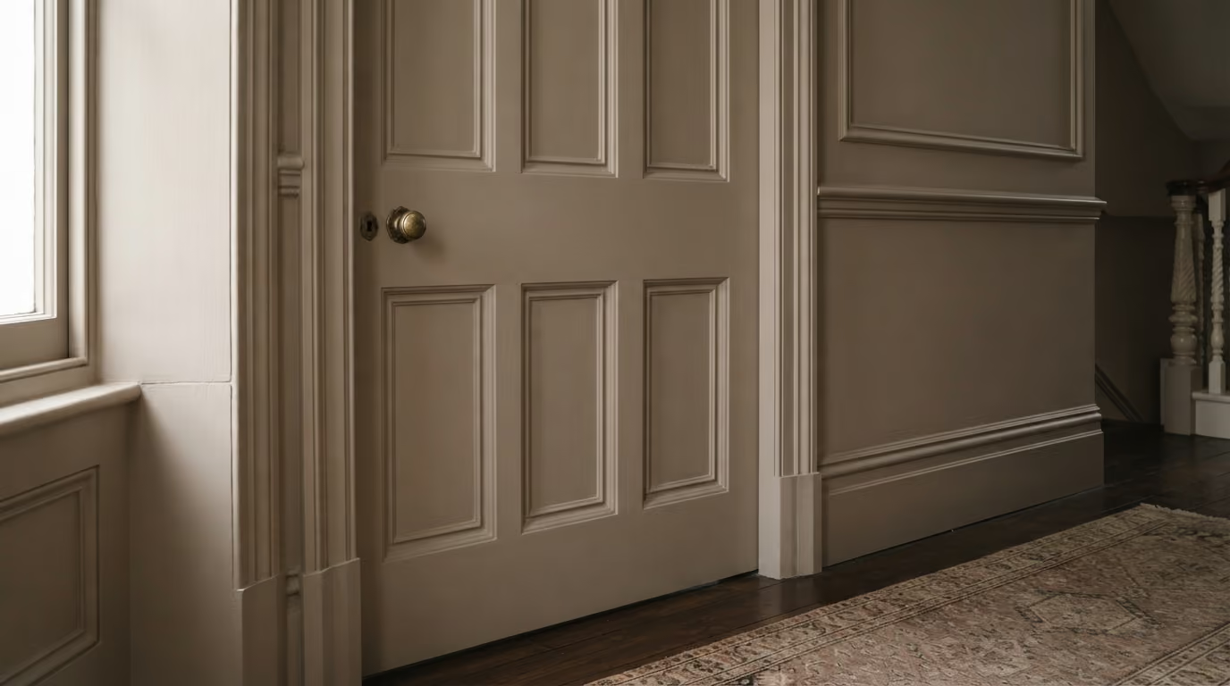
Panelled walls can be particularly well suited to colour drenching.
The individual mouldings create enough physical depth that the surface can remain interesting even without contrasting colours.
This works with:
Using one colour allows the architecture to become the main source of detail.
It can also help contemporary panelling sit more comfortably within a period property when the new joinery has been designed around the proportions of the room.
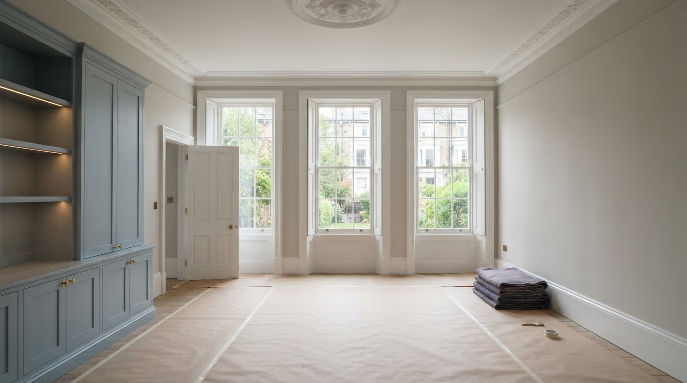
A colour drenched study or reception room may contain fitted bookshelves, alcove cabinets, or other architectural joinery.
Painting these in the same colour as the walls can make the cabinetry feel more integrated.
However, there are a few decisions to make first.
Should the inside of the shelves also match? Should the cabinet doors use the same colour? What happens to the back panels? Will integrated lighting change how the finish looks?
There is no need for every cabinet interior to be identical.
For example, a study might have deep green walls and fitted shelves in the same green, while the interior backs of selected open shelves remain natural timber.
This creates a little contrast without disrupting the overall approach.
Any new cabinetry should be installed, adjusted, and prepared before final wall decoration.
The most successful colour is not necessarily the deepest or most fashionable shade.
It should work with the existing architecture and materials.
Consider the colours already present in:
For a restrained effect, warm stone, putty, mushroom, clay, and muted grey green can work well.
For a stronger effect, deep olive, tobacco, warm charcoal, rich blue, and earthy brown tones may be appropriate.
The important distinction is between selecting a colour that looks attractive on its own and selecting one that works across an entire room.
Colour drenching amplifies the chosen shade because it appears on more surfaces than a traditional wall only scheme.
A neutral colour may have subtle green, pink, yellow, or grey undertones.
On one wall, those differences can be relatively easy to overlook.
When the same colour extends across the ceiling, doors, and joinery, its undertone becomes a much larger part of the interior.
For example, a warm taupe may sit beautifully beside oak flooring but feel unexpectedly pink beside a particular marble fireplace.
Similarly, a cool grey green may work well beside dark timber but appear colder in a north facing room.
Samples should therefore be checked against all the major fixed materials, not just against the existing wall colour.
North facing Belgravia interiors often receive cooler, indirect daylight.
This can affect both pale and deep colour schemes.
A cool pale neutral may appear greyer than expected, while a deep blue can become particularly strong in a room with limited natural light.
Warmer shades such as putty, mushroom, muted olive, tobacco, and soft clay may be worth exploring.
However, there is no universal rule requiring every north facing room to use warm colours.
The desired atmosphere matters. A cooler palette may be entirely appropriate for a formal study or another room intended to feel more restrained.
Strong daylight can make colours appear brighter and reveal undertones that were less obvious on a sample card.
A muted clay may look considerably warmer in direct sunlight.
A deep olive may appear lighter and more complex during the afternoon.
Large sample areas should be assessed under changing daylight rather than only under artificial showroom lighting.
Reception rooms and studies may contain:
Each can change how the painted surfaces appear.
A colour drenched scheme makes this especially noticeable because the same colour is present on vertical, horizontal, and moulded surfaces.
Directional wall lighting can also reveal preparation defects, especially on dark or higher sheen finishes.
Samples should be reviewed under the lighting the room will actually use in the evening.
Not automatically.
A period fireplace may contain stone, marble, metal, or decorative timber.
Natural stone often works best when treated as an existing architectural material rather than something that must be brought into the painted colour scheme.
A painted timber fireplace surround may offer more flexibility.
Possible approaches include:
The fireplace should be considered alongside the artwork or mirror above it and any cabinetry on either side.
Yes, and it can actually provide a useful background for more decorative furniture.
When walls, ceilings, and joinery share one colour, the room may have fewer competing architectural boundaries.
This can allow patterned upholstery, rugs, and artwork to stand out more clearly.
However, the chosen paint colour should still relate to the fabrics and furniture.
A strong patterned curtain, for example, may influence whether the room should use a warm neutral or a deeper colour drawn from the textile.
A colour drenched room does not need to match every adjoining space.
However, the transition should feel deliberate.
One useful approach is to maintain a relationship between the undertones of the two schemes.
For example, a pale stone hallway may lead into a deeper olive study or a warm charcoal dining room.
The colours are different, but the materials and undertones can still feel connected.
Doorways deserve particular attention because an open door allows both schemes to be seen at the same time.
The door colour should therefore be considered from both sides rather than only from within the colour drenched room.
Absolutely.
Colour drenching can be introduced into one room without changing the decorative approach throughout the property.
A study, dining room, or bedroom can have a more enveloping colour scheme while the entrance hall and other reception areas remain pale.
This can be particularly effective in a large townhouse where different rooms have distinct uses and atmospheres.
The key is to ensure the transition at the doorway feels considered.
Deep colours can create beautiful interiors, but they may also reveal imperfections more readily under certain lighting conditions.
Before decorating, inspect the walls and joinery for:
Strong side light can expose defects that were barely noticeable under the previous decoration.
The preparation standard should be agreed before the final finish is applied.
When the ceiling is included in a colour drenched scheme, it becomes a deliberate decorative surface rather than an overlooked white background.
That makes its condition particularly important.
Old ceiling roses, cornices, plaster repairs, and previous electrical alterations may all need attention.
Inspect the ceiling under natural light where possible, particularly if the room has tall windows.
A fresh coat of deep colour will not conceal uneven plaster or raised repair edges.
Using one colour does not mean one product should be used everywhere.
Walls, ceilings, doors, skirting, and cabinetry have different demands.
For example:
The colour relationship should be checked using actual samples of the proposed products.
Preparation, primers, compatibility, and application methods should be selected according to the surfaces involved.
A colour drenched room often involves more coordinated painting than a conventional wall only repaint.
Doors, ceilings, skirting, cabinetry, and cornices may all need attention.
Before the final coats begin, complete any disruptive work involving:
The room should then be prepared as one project.
This helps maintain consistent finishing standards and reduces the risk of new work damaging completed surfaces.
Not usually.
Different sheen levels can be useful even when the colour remains the same.
A matt wall beside slightly more reflective joinery creates subtle definition.
Matching the ceiling and walls in a restrained finish may help the room feel continuous, while allowing door panels and skirting to remain distinguishable.
The decision should be driven by the surfaces, practicality, and desired visual effect rather than an assumption that colour drenching requires identical paint everywhere.
Small colour cards rarely reveal how a full colour drenched room will feel.
Before committing, review the proposed colour across several positions.
Ideally, assess:
It is also useful to check how the colour looks from the doorway.
A scheme that feels attractive when standing in the centre of the room may create a very different impression when viewed from an adjoining pale hallway.
The most successful colour drenched interiors are carefully balanced rather than simply monochromatic. The architectural detail, lighting, sheen, natural materials, and furniture all contribute to making the room feel complete.
What is colour drenching? Colour drenching involves using the same colour, or closely related tones, across several surfaces such as walls, ceilings, doors, skirting, and other architectural joinery.
Does colour drenching work in period properties? Yes. It can be particularly effective in period rooms with decorative cornices, tall doors, panelling, and fitted cabinetry because these features remain visible through their shape and shadow.
Should the ceiling be the same colour as the walls? It can be. Matching the ceiling can create a more continuous appearance, although the right approach depends on the room's proportions, lighting, and chosen colour.
Does colour drenching make rooms look smaller? Not necessarily. Removing contrasting boundaries can make a space feel more continuous, although deeper colours also affect perceived brightness and atmosphere.
Should skirting and doors use the same finish as the walls? They can use the same colour, but suitable joinery coatings may have different sheen and durability characteristics from wall paint.
Can you colour drench a room with decorative cornices? Yes. Matching the cornice with the surrounding surfaces can emphasise its architectural shape and shadow rather than relying on contrasting colour.
Can fitted bookshelves match the walls? Yes. Painting fitted shelving in the same colour can help integrate it into the architecture, particularly in studies and libraries.
Is colour drenching suitable for a north facing room? It can be. The colour should be tested under the room's actual daylight and artificial lighting because cooler light can change how both pale and deep shades appear.
We carry out interior painting and decorating across Prime Central London, including Belgravia, Chelsea, Kensington, Notting Hill, Knightsbridge, and Westminster. Our work includes period reception rooms, studies, dining rooms, bedrooms, decorative cornices, ceilings, wall panelling, doors, skirting, fitted cabinetry, and detailed architectural joinery.
Considering colour drenching for a room in your Belgravia home? Send photographs of the room showing the walls, ceiling, cornices, doors, skirting, fireplace, fitted joinery, flooring, and natural light, along with any colours or samples you are considering. We can assess the surfaces, discuss suitable colour and sheen combinations, and plan the preparation and decorating work to create a cohesive result that respects the room's architecture. To begin, request a site visit and we will arrange a time that suits you.
Tell us a few details about your project and our team will review the enquiry and come back to you within one working day.