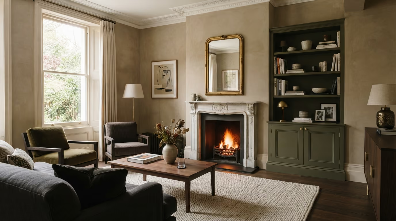
Bauwerk limewash can work beautifully alongside painted doors, skirting, shelving, panelling, and fitted cabinetry. This guide explains how to coordinate colour, sheen, lighting, and preparation so the mineral wall finish and architectural joinery feel balanced throughout the room.
The practical answer: Bauwerk limewash can work particularly well alongside painted joinery in a Chelsea home because the two finishes create a useful contrast. Limewash gives the walls soft mineral movement, while painted doors, skirting, shelving, panelling, and fitted cabinetry provide cleaner architectural lines. The key is to choose colours and sheen levels together rather than treating the walls and joinery as separate decisions. For specialist preparation and application, see our Bauwerk limewash service.
Many Chelsea interiors contain more painted joinery than first appears. Alongside doors and skirting, there may be window shutters, fitted bookshelves, alcove cabinets, wardrobes, wall panelling, radiator covers, architraves, cornices, and bespoke storage.
When all of these elements sit beside limewashed walls, their relationship becomes important. A crisp white that works against standard painted walls may feel too stark beside a warm mineral finish. A dark cabinet colour can look beautiful against pale limewash, but may become visually heavy if the room has limited natural light. A warm neutral used on both walls and joinery can create a quieter effect, but the colours still need enough difference for the architecture to remain clear.
This guide explains how to combine Bauwerk limewash with painted joinery in a Chelsea home, including colour relationships, doors, skirting, fitted cabinetry, panelling, fireplaces, lighting, preparation, and how to decide whether the joinery should contrast with the walls or sit more quietly beside them.
Limewash and painted joinery have different visual characteristics.
Bauwerk limewash has natural tonal movement. The wall does not read as one perfectly flat block of colour. Light changes the surface throughout the day, creating gentle shifts in depth and tone.
Painted joinery usually has a more controlled and uniform appearance. Even when the colour is soft, the finish creates clear edges around doors, cabinets, shelves, and mouldings.
Used together, these finishes can provide:
The combination works particularly well in period properties where original architecture and newer fitted joinery need to sit comfortably together.
One of the easiest mistakes is choosing the limewash first and treating the joinery colour as a later decision.
The two surfaces are seen directly beside one another, so their undertones affect each other.
For example:
Samples should therefore be tested side by side in the actual room.
Check them near windows, in darker corners, beside flooring, and under the lighting normally used in the evening.
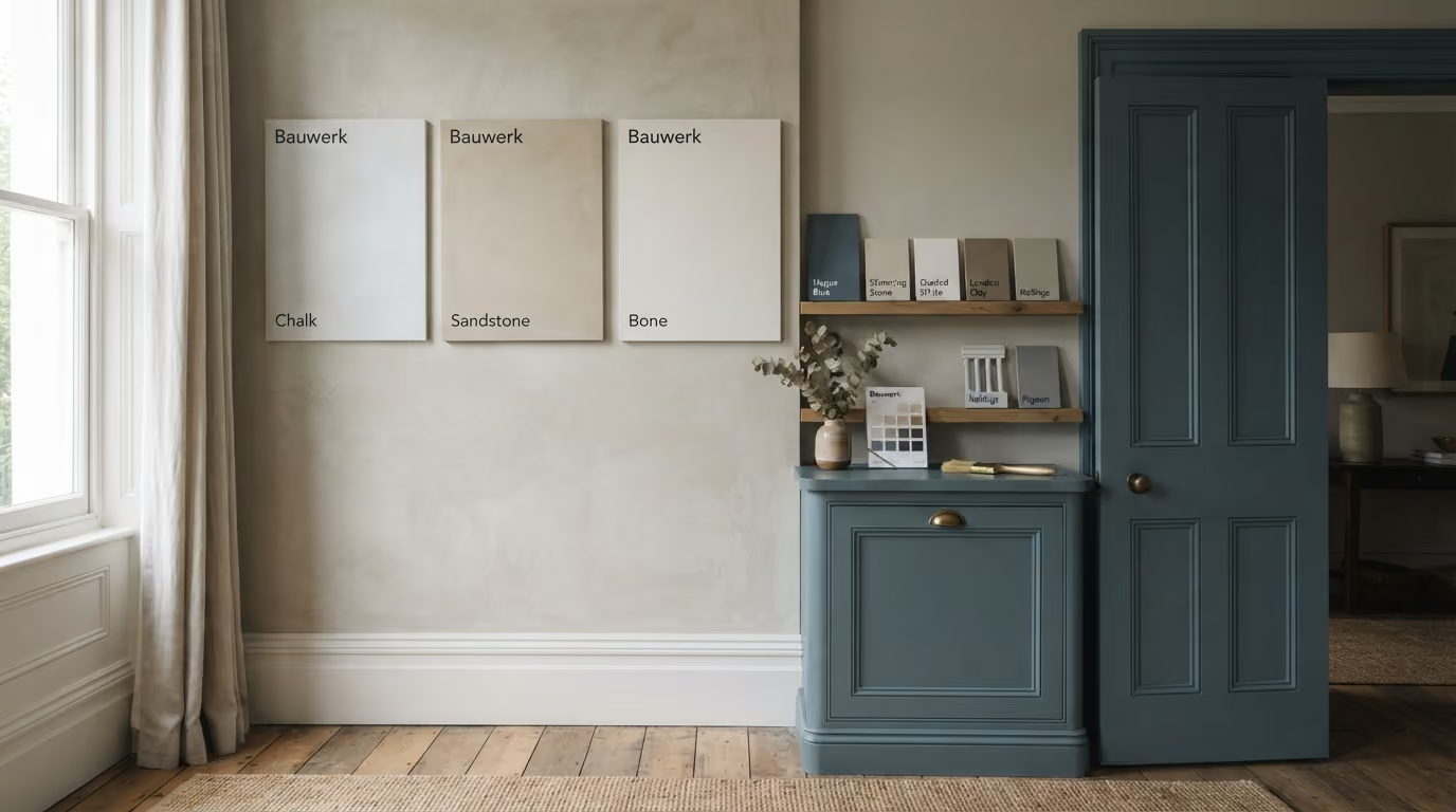
Brilliant white remains common for doors, skirting, and architraves, but it is not automatically the best partner for limewash.
A warm mineral wall often sits more comfortably beside a softer white or restrained neutral.
Possible joinery directions include:
These colours can keep the architecture clear without creating a sharp outline around every door and piece of skirting.
This is particularly useful in reception rooms and bedrooms where the aim is a calm, cohesive interior rather than strong contrast.
Dark painted joinery can create a very different effect.
Instead of disappearing into the room, doors, cabinets, shelving, or panelling become deliberate architectural features.
Dark joinery may work particularly well with pale limewash when:
Deep olive, warm charcoal, brown based neutrals, muted blue, and near black can all work depending on the wider interior.
The undertone remains important. A blue black cabinet beside a warm clay limewash may feel disconnected, while a warmer charcoal or dark olive may sit more naturally with the mineral wall.
Traditionally, doors, architraves, and skirting are often painted in the same colour. This still works well and creates continuity throughout the room.
However, they do not always need to match.
Possible approaches include:
The more colours introduced, the more carefully the room needs to be balanced.
In many Chelsea interiors, two main decorative colours plus the ceiling are enough. Additional contrast can then come from furniture, flooring, stone, metal, and artwork.
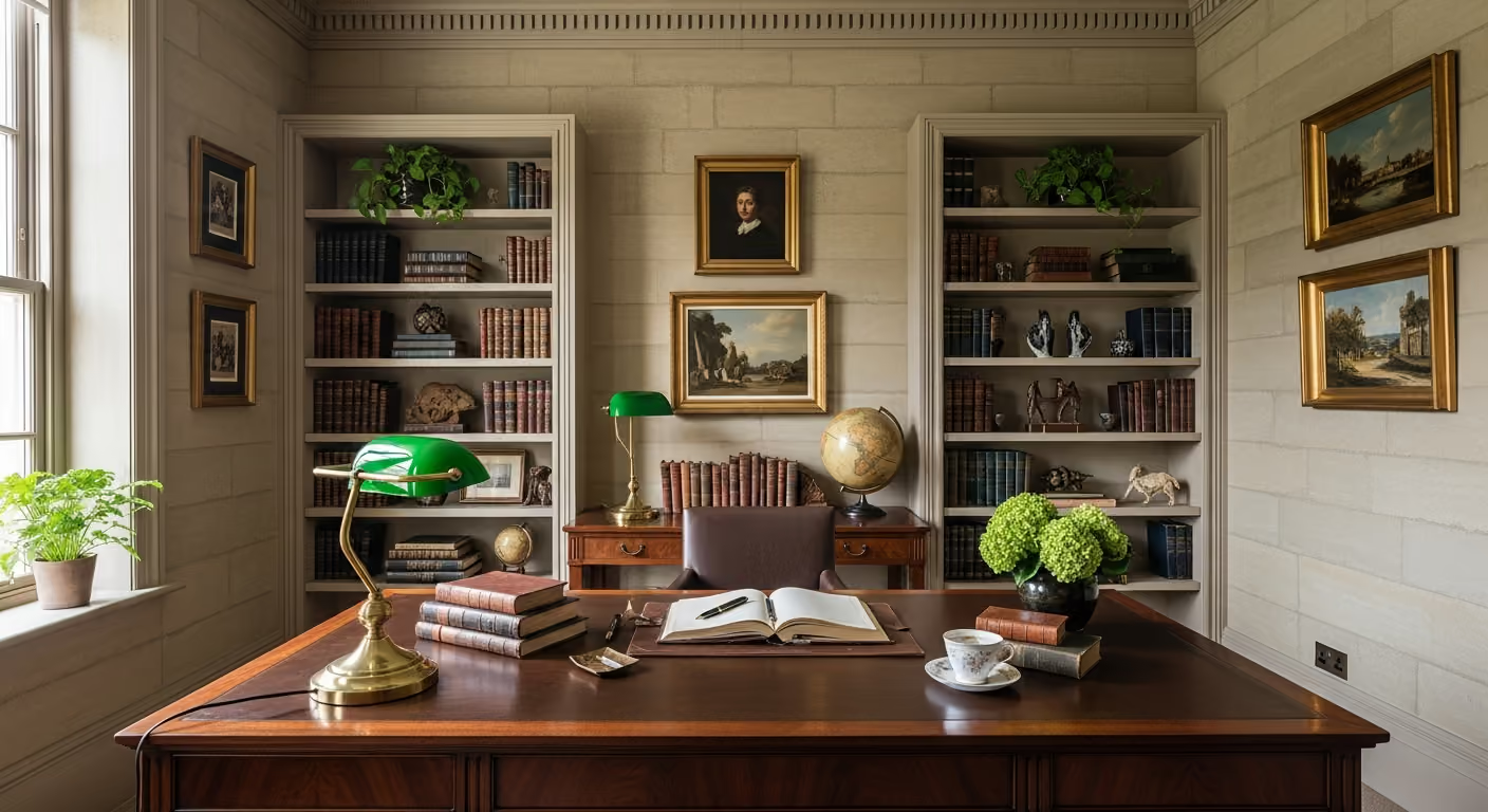
Alcove cabinets are a common feature in Chelsea reception rooms. They may sit beside a fireplace and combine lower cupboards with open shelves above.
Limewash can provide a beautiful background because its natural movement contrasts with the clean geometry of the joinery.
There are several ways to approach the colour.
This keeps the cabinetry visually crisp and can help a deeper wall colour feel less heavy.
This creates stronger contrast and makes the fitted joinery a focal point.
Using related warm neutrals for both surfaces creates a softer, more integrated appearance.
The right approach depends on the fireplace, shelving contents, natural light, and whether the joinery should disappear or become part of the room's visual identity.
If the fitted furniture itself needs refinishing, this can be planned through our interior painting and decorating service before the final limewash application.
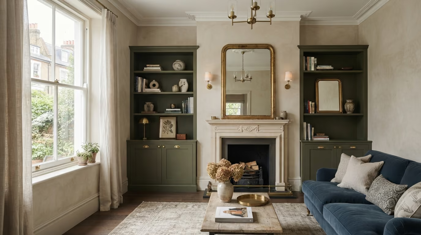
It can, and in many cases this creates additional depth.
Open shelves allow sections of the wall to remain visible between books and objects. A limewashed background can feel more layered than simply painting the back of the shelving unit in the same colour as the cabinet.
This works well when:
However, all electrical work, shelf positions, and fixings should be completed before the limewash is finished.
Changing shelves later can leave fixing holes or marks that are harder to disguise than on standard painted walls.
A room does not need to choose between panelling and limewash.
Painted panelling can be used on the lower section of the wall with limewash above, particularly in entrance rooms, dining areas, studies, and reception spaces.
This combination provides:
The height of the panelling should relate to the architecture. Window sills, fireplaces, furniture, switches, door panels, and ceiling height all influence where the horizontal division should sit.
Adding panelling simply at an arbitrary height can make an otherwise elegant room feel awkward.
It depends on how strongly the architecture should read.
A pale stone limewash above slightly deeper putty panelling creates subtle definition.
A pale limewash above dark green or charcoal panelling creates much stronger contrast.
Using almost the same colour on both can create a very quiet result where the difference comes mainly from texture and sheen rather than colour.
This last approach can work particularly well in rooms with detailed furniture, artwork, or strong flooring where another obvious colour break is unnecessary.
Period Chelsea homes may contain original or traditional style window shutters. These occupy a significant amount of visual space when closed and frame the windows when open.
They should therefore be considered alongside:
Painting shutters brilliant white while every other colour in the room is warm can create more contrast than expected.
A softened joinery colour often helps the windows feel integrated into the room.
Not every piece of joinery needs to be painted.
Natural oak, walnut, and other timber finishes can work beautifully beside mineral walls because both surfaces have natural variation.
This may be appropriate for:
Keeping good timber visible can also introduce warmth into a room where most other architectural elements are painted.
The decision should depend on the condition and quality of the timber rather than assuming everything needs a painted finish.
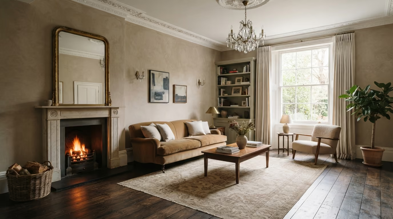
Painted timber fireplaces are common in period interiors and can create a natural focal point against limewashed walls.
A pale fireplace beside a deeper wall increases definition. A fireplace painted in a related tone can feel quieter and more integrated.
Before choosing either colour, check:
The fireplace should not be treated as an isolated piece of woodwork. It sits at the centre of several materials and colours.
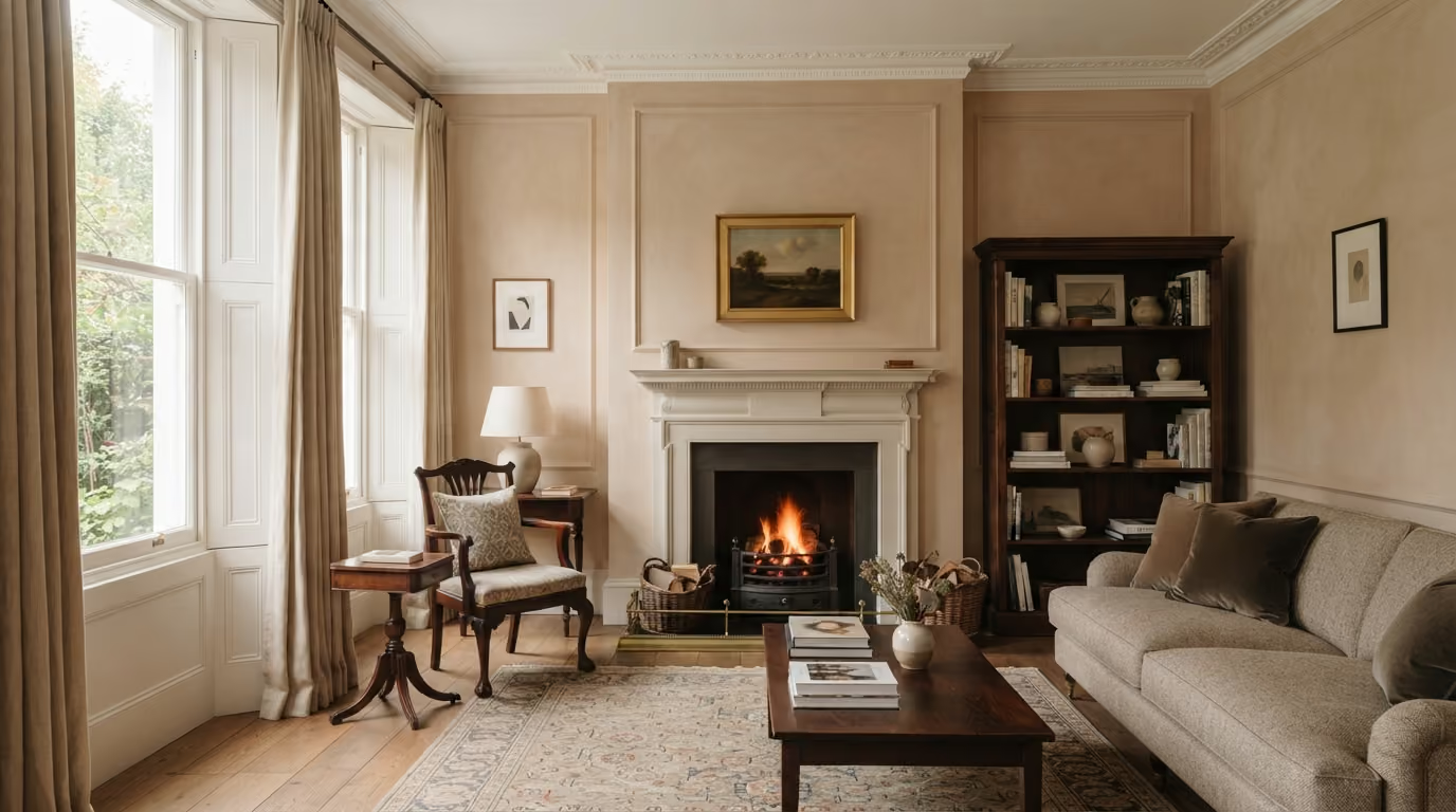
Colour is not the only difference between limewashed walls and painted joinery.
The sheen of the woodwork also affects how the room feels.
Bauwerk limewash has a very soft mineral appearance. Painted woodwork may have more sheen, depending on the coating system selected.
This can help define:
A subtle difference is often enough. Very glossy joinery creates a much stronger visual contrast and requires particularly careful preparation because reflections reveal surface defects.
Limewash and joinery painting involve different surfaces, but the preparation stages should be planned together.
Walls may require:
Joinery may require:
The transitions between them also matter. Wall edges beside architraves, skirting, cabinets, and panelling should be clean before either final finish is applied.
Any new cabinetry, shelving, panelling, electrical work, or major joinery repairs should be complete before the final wall finish.
Installation can involve:
Doing this after the limewash is complete increases the risk of damage and difficult local touch ups.
A coordinated decorating sequence is therefore particularly important in rooms with bespoke joinery.
A joinery colour and limewash sample that look almost identical during the day may separate much more clearly under evening lighting.
This happens because the two surfaces reflect light differently.
Test samples under:
Look at them in the morning, afternoon, and evening where possible.
The objective is not for the colours to remain identical throughout the day. It is to make sure the changes remain attractive under the conditions in which the room is actually used.
North facing Chelsea rooms can make pale neutrals appear cooler than expected.
If both the limewash and joinery colours have cool undertones, the whole room may begin to feel flat.
Warmer directions such as stone, putty, clay, mushroom, muted olive, and soft ivory may be more comfortable.
The joinery does not necessarily need to be warmer than the walls. The two simply need to sit comfortably within the same overall palette.
Strong daylight gives more flexibility with deeper limewash and joinery colours.
However, direct sunlight can also make warm colours appear much stronger.
A pale clay that looks subtle in a darker room may become noticeably warmer in direct afternoon sun.
Samples should therefore be placed on more than one wall, particularly where the room receives strong sunlight at different times of day.
The most successful rooms do not make the walls and woodwork compete. The limewash provides depth while the joinery gives the architecture structure and definition.
Does painted joinery have to be white with Bauwerk limewash? No. Soft neutrals, deeper colours, and even related versions of the wall colour can all work well.
Can dark cabinets work with pale limewash? Yes. Dark fitted joinery can create strong architectural contrast, particularly in rooms with good natural light.
Should doors and skirting be the same colour? They can be, and this creates continuity, but different colours can also work when the relationship is planned carefully.
Can limewash be used above painted panelling? Yes. Painted panelling below limewash can create a useful combination of practical lower walls and softer mineral texture above.
Can Bauwerk limewash be used behind open shelving? Yes, provided the wall is prepared correctly and all shelf positions and electrical work are completed before finishing.
Should joinery colour samples be tested beside the limewash? Yes. Both colours should be viewed together in the actual room because their undertones and finishes affect how each one appears.
We carry out Bauwerk limewash, interior painting, and detailed decorating projects across Prime Central London, including Chelsea, Kensington, Belgravia, Notting Hill, Knightsbridge, and Westminster. Our work includes reception rooms, bedrooms, studies, dining rooms, entrance halls, fitted cabinetry, doors, panelling, shelving, and other interiors where wall finishes and architectural joinery need to work together.
Considering Bauwerk limewash alongside painted joinery in a Chelsea home? Send photographs of the room, including the windows, doors, skirting, fitted cabinets, panelling, fireplace, flooring, and any colours you are considering. We can assess the walls and joinery, plan suitable samples, and help create a palette where the mineral wall finish and painted architectural details work together naturally. To begin, request a site visit and we will arrange a time that suits you.
Tell us a few details about your project and our team will review the enquiry and come back to you within one working day.