Considering Bauwerk limewash for a Kensington reception room with artwork? This guide explains how to choose the right colour, prepare the walls, plan picture lighting, and create a soft mineral background that adds depth without competing with the art.
The practical answer: Bauwerk limewash can be an excellent choice for a Kensington reception room when you want the walls to add depth without competing with artwork, furniture, or period details. Its soft mineral movement can make neutral colours feel richer and create a calm background for framed pieces. The best result depends on careful colour testing, suitable wall preparation, thoughtful lighting, and a clear plan for hanging art after the finish is complete. For specialist advice and application, see our Bauwerk limewash service.
A reception room often carries the visual identity of a Kensington home. It may contain favourite paintings, framed photography, sculpture, antique furniture, contemporary pieces, or a collection built over many years. The walls need to support all of these elements without becoming empty or distracting.
Standard paint can provide a clean background, but a flat colour can sometimes feel too plain in a room with layered furniture and art. Strong wallpaper may introduce more pattern than the room needs. Bauwerk limewash offers another option. It creates soft movement and subtle changes in tone, giving the walls depth while allowing the artwork to remain the main focus.
This balance makes limewash particularly appealing for reception rooms. The finish can feel quiet from a distance, then reveal more texture as the light changes. It works well beside period cornices, fireplaces, timber floors, stone details, painted joinery, and carefully chosen lighting.
This guide explains how to use Bauwerk limewash in a Kensington reception room with art, including colour choice, wall preparation, lighting, hanging considerations, and how to keep the room refined rather than visually busy.
Artwork often looks best against a wall that has some depth but not too much visual noise. A bright white wall can create strong contrast, which suits some contemporary collections but can feel stark in a period home. A dark painted wall can look dramatic, but it may change how colours in the artwork are perceived. Patterned wallpaper can compete with frames and images.
Limewash creates a softer background. Its movement is irregular but restrained. The surface has enough life to stop the wall feeling flat, while the absence of a repeated pattern allows each artwork to keep its own space.
It works particularly well because:
The wall becomes part of the atmosphere, but not the loudest element in the room.
If artwork is already chosen, it should influence the limewash colour. The aim is not to match the paintings or prints exactly. It is to create a background that supports their dominant tones and gives them enough contrast.
Before selecting samples, look at:
A collection with warm landscapes, gilt frames, and antique furniture may suit a warm stone or soft clay limewash. Black and white photography can look beautiful against putty, taupe, or muted grey brown. Bright contemporary art may need a calmer and lighter background so the colours remain clear.
The best wall colour usually supports the collection as a whole rather than responding to one single piece.
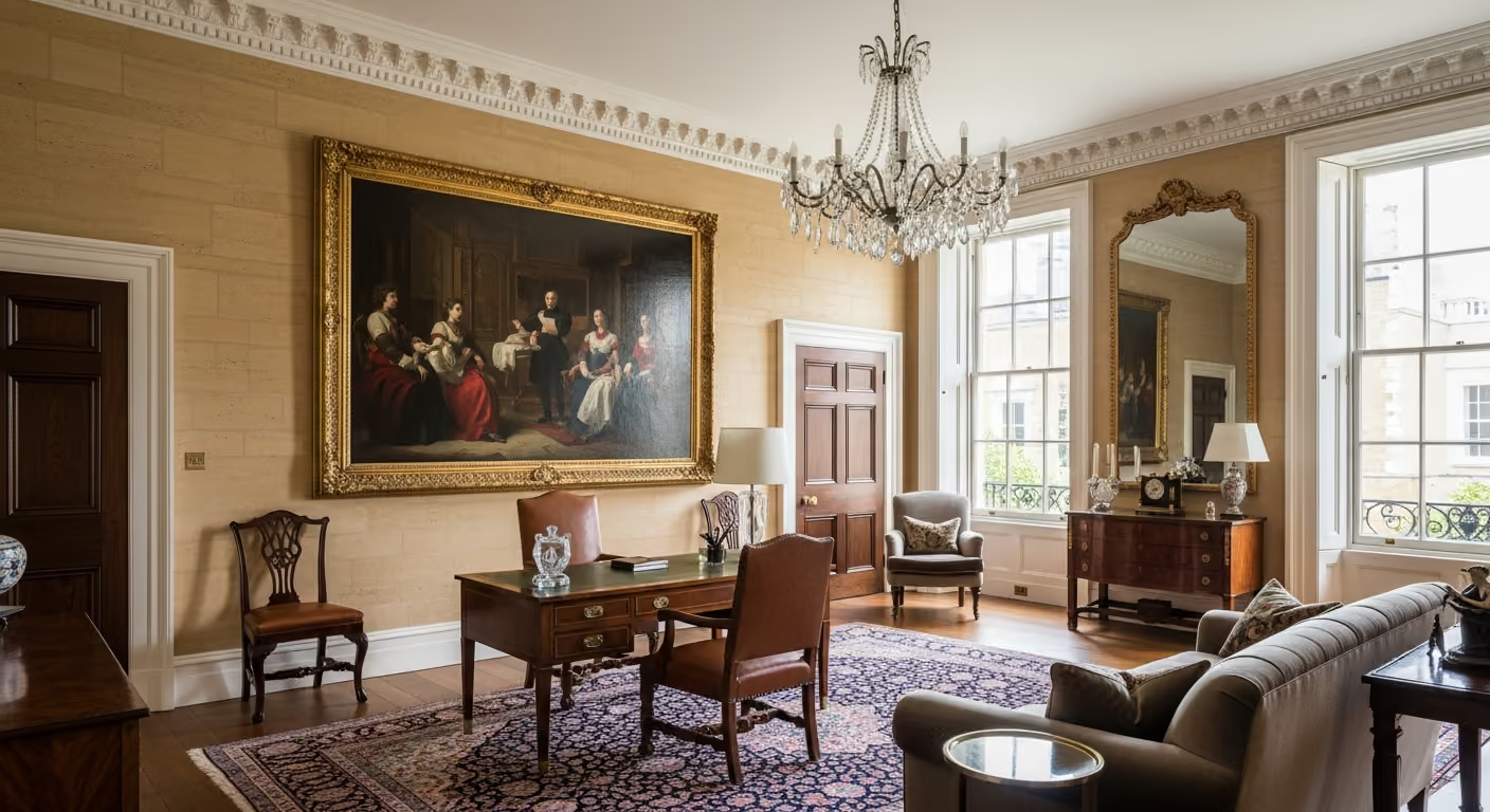
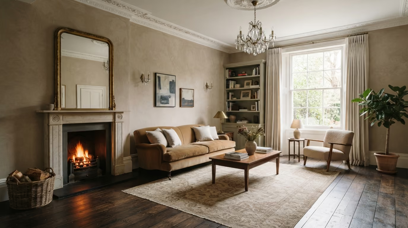
Warm stone tones are often a strong choice for Kensington reception rooms. They feel more layered than white, but remain neutral enough for most art collections. They also work well with fireplaces, timber floors, warm metals, and traditional architectural details.
A warm stone limewash can:
The exact undertone matters. Some stone colours lean grey, some beige, and some slightly pink or green. Large samples should be tested beside the artwork and furniture before the final choice is made.
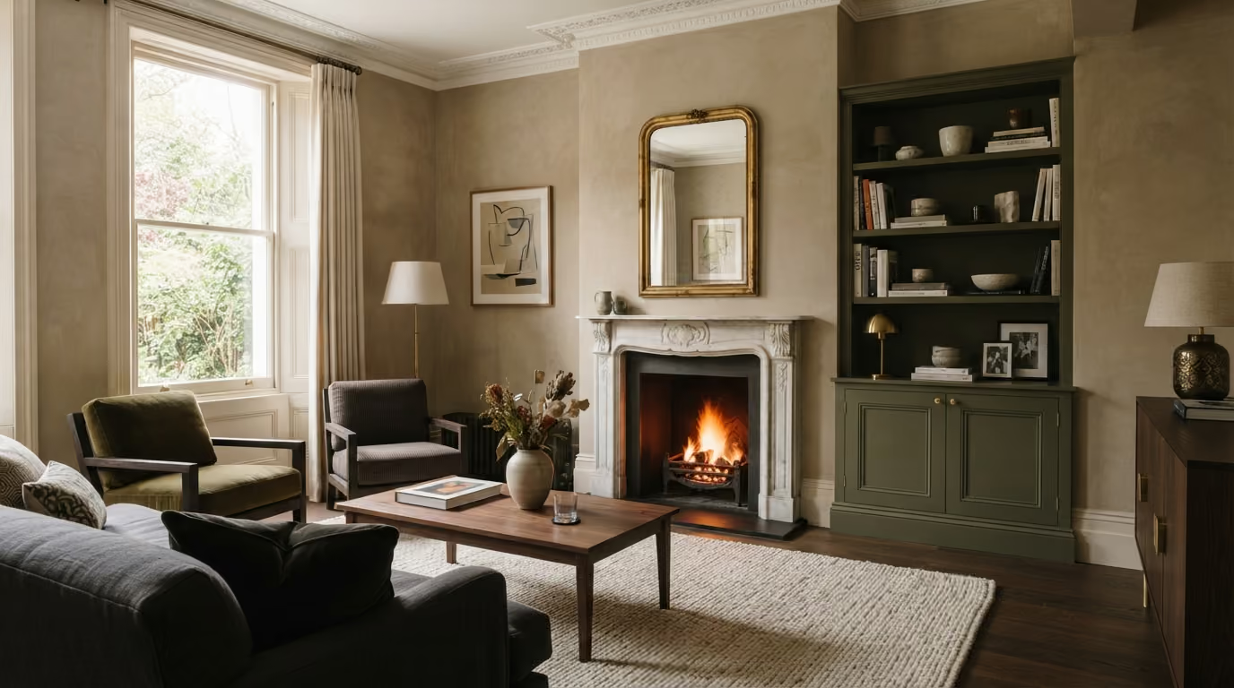
A deeper limewash can create a beautiful gallery like atmosphere, especially in a room used mainly in the evening. Taupe, muted olive grey, soft tobacco, and deeper clay tones can make pale or gilt framed artwork feel more important.
Deeper colours tend to work well when:
A darker sample can feel manageable on a small board but much stronger across four walls. It should be tested over a generous area and viewed from the main seating position. If the colour feels heavy at the sample stage, it will probably feel heavier once applied throughout the room.
Kensington reception rooms often have tall sash windows that create strong directional light. This light can make limewash look very different from one wall to another. A wall facing the window may appear lighter and more even. A side wall may reveal more texture. A wall opposite the window may show deeper tonal movement.
This changing surface is part of the appeal, but it needs to be tested carefully when artwork is involved.
Check samples:
The wall behind the most important artwork should receive special attention. If strong side light reveals too much texture or makes the colour shift, another tone or position may work better.
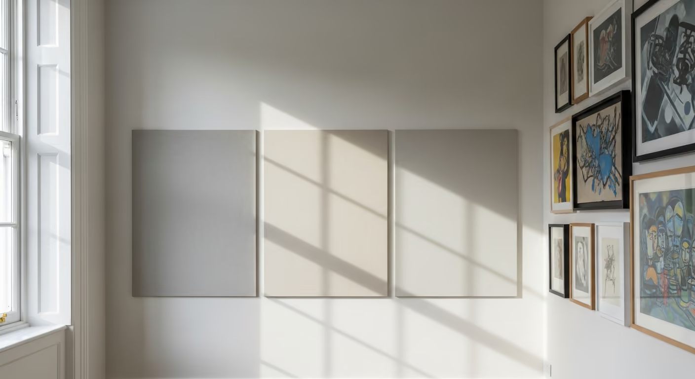
Reception rooms are often used most in the evening. Table lamps, wall lights, picture lights, and floor lamps create a completely different mood from daylight. A limewash that feels cool during the day may become warmer at night. A deeper colour may feel rich and inviting, or too enclosed if the lighting is weak.
Samples should be viewed under the actual lighting plan. Consider:
Very cool artificial light can make warm neutral limewash look dull or grey. Warm lighting usually supports the mineral depth more naturally, but it should not make the walls appear overly yellow.
Picture lights are designed to bring attention to art, but they also illuminate the wall around the frame. On a limewashed surface, this can enhance the finish beautifully or reveal uneven preparation.
Before installing picture lights, consider:
Lighting positions should ideally be confirmed before the limewash work begins. Moving lights later can create new holes and repairs in a finished wall, which may be harder to blend than with standard paint.
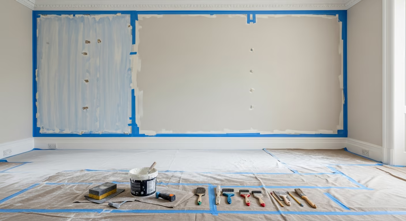
Limewash does not hide poor walls. Raised filler edges, old fixing holes, cracks, paint ridges, and uneven repairs can all remain visible, especially under picture lights or side light.
Reception rooms with art often have a long history of hanging and rehanging. The walls may contain many old holes, plugs, hooks, and repaired sections. These should be assessed carefully before the finish is applied.
Good preparation may include:
The final wall should still have the natural character of limewash, but the underlying surface should feel controlled.
If possible, decide where the main artwork will hang before the wall is finished. This helps with lighting, electrical work, fixing points, and overall composition.
Planning early can help avoid:
Not every artwork position needs to be permanent, but the main pieces should be considered as part of the decorating plan.
Artwork can be hung on limewashed walls, but the fixings should be chosen carefully. The correct method depends on the wall construction, the weight of the piece, and whether the wall is plaster, masonry, or another material.
Useful planning includes:
A picture rail can be especially useful in period rooms. It allows art to be adjusted with less direct damage to the finished wall and can suit the historic character of the space.
Limewash touch ups can be less predictable than standard paint. Because the finish has natural movement, a small repaired patch may blend reasonably well or may remain visible depending on the colour, light, and application.
If artwork is moved later:
This does not mean artwork cannot change. It simply means positions should be considered more carefully than they might be on a standard painted wall.
Many Kensington reception rooms are organised around a fireplace. Limewash can work beautifully around stone, marble, timber, or painted surrounds because its mineral surface adds softness without competing with the main feature.
Colour should be checked beside:
A warm stone limewash may connect beautifully with aged marble. A putty tone can support a dark stone surround. A muted olive grey may suit antique furniture and a traditional fireplace, provided the room has enough light.
Limewash walls often look best when the cornice and ceiling provide a crisp but gentle frame. A brilliant white ceiling can feel too harsh beside a warm mineral wall. A softened white usually creates a smoother transition.
The cornice can:
The choice depends on the height of the room and the level of contrast desired. Period plaster details should be prepared carefully so paint build does not soften their profile.
Smooth painted or spray finished joinery can look especially good beside limewash. The walls bring soft mineral movement, while shelves, doors, cabinets, and skirting provide cleaner lines.
This contrast works well for:
The colours should still feel related. A cold white cabinet may look harsh against warm limewash. Soft off white, stone, putty, or a slightly deeper related tone often creates a more refined result. For coordinated joinery and wall preparation, see our interior painting and decorating service.
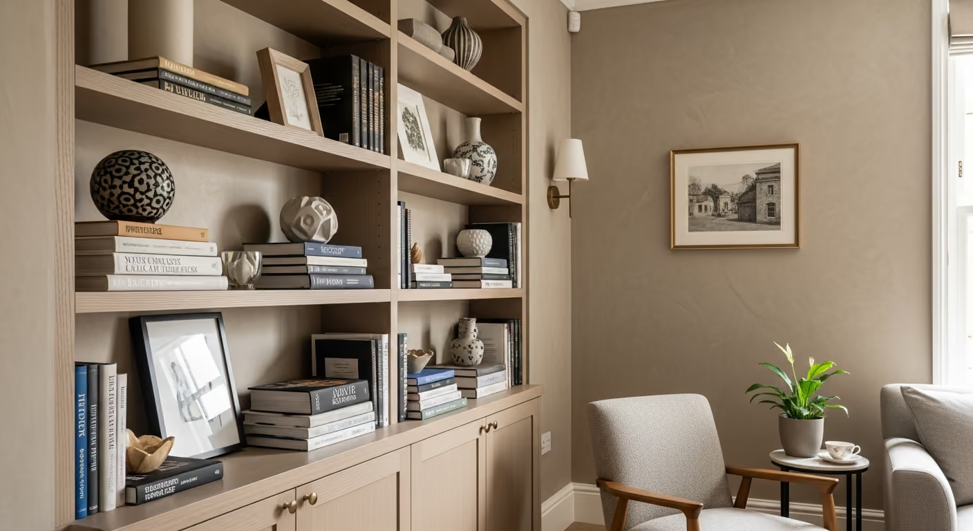
A full room treatment usually creates the most complete effect. It allows the light and colour to move naturally around the space and avoids turning one wall into an isolated feature.
Full room limewash works well when:
A single limewash wall may work when:
Without a clear focal purpose, one limewashed wall can feel disconnected. In a formal reception room, a complete scheme is often more elegant.
Limewash is not automatically the best background for every art collection. Standard paint may be more suitable if the client wants a completely uniform gallery wall, frequent rehanging, simple touch ups, or very precise colour control.
Paint may be better when:
The best finish should support how the room is actually used. Limewash suits a more settled collection and a room where texture is part of the design.
The strongest results come when the artwork, wall colour, lighting, and architecture are planned together.
Is Bauwerk limewash a good background for artwork? Yes. Its soft matt surface and subtle movement can create depth without competing with framed pieces, provided the colour and lighting are planned carefully.
Will picture lights show the texture? They can. This can look beautiful, but it also means the wall preparation and application need to be controlled.
Can artwork be moved after the walls are limewashed? Yes, but old fixing holes may require careful repair. Touch ups can be less predictable than with standard paint.
What limewash colours work best with art? Warm stone, putty, soft taupe, muted clay, and gentle olive grey are often strong choices. The correct tone depends on the collection, frames, furniture, and light.
Should the whole room be limewashed? Often, yes. A full room treatment usually feels more complete, especially when artwork is displayed on several walls.
We carry out Bauwerk limewash projects across Prime Central London, including Kensington, Chelsea, Belgravia, Notting Hill, Knightsbridge, and Westminster. Many of these projects involve reception rooms, dining rooms, bedrooms, studies, fireplaces, period plasterwork, and private art collections where colour, lighting, and wall preparation need to be carefully coordinated.
Considering Bauwerk limewash for a Kensington reception room with artwork? Send photographs of the room, the main art pieces, frames, windows, fireplace, lighting, and any colours you are considering. We can help assess the walls, plan suitable sample panels, and choose a finish that adds depth while allowing the artwork and architecture to remain the focus. To begin, request a site visit and we will arrange a time that suits you.
Tell us a few details about your project and our team will review the enquiry and come back to you within one working day.