Seven eras of period paint to transform your interior in 2024
The last 300 years have seen dramatic evolutions in interior design, giving rise to some truly timeless shades that have transcended the ages. In this article, we’ll explore seven eras of period paint colours created by Little Greene which all breathe life into modern homes.
The eras of interior design
From the birth of modern interior design in the Georgian period to the mass market availability of the 60s, here are seven paint schemes that have stood the test of time:
Georgian paint colours
The moody greys and neutral shades established in the Georgian era are as relevant today as they were in the 1700s. Being able to take inspiration from different eras to mix and match means we can draw upon the timeless elegance of Lead and pearl colours of the time while revitalising the modern luxury home.
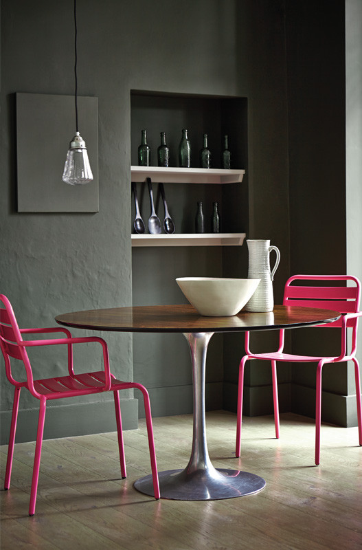
Regency Paint Colours
The Regency period saw designers start to branch out and integrate vibrant colours into interior design. These Pea Greens and Yellow Pinks look as fresh and inviting today as they did back then.
The soothing Celestial Blue also popular at this time works perfectly to create relaxing spaces in bedrooms and lounges, while Linen Wash and Juniper Ash pair subtly with many of the boldly patterned wallpaper trends of today.
Victorian paint colours
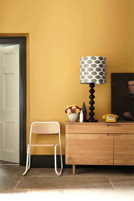
Victorian paint colours shine in their versatility. While the shades of the time were often slightly darker than those seen in modern homes, lighter shades offer a contemporary interpretation of the classic Victorian look and create airy interiors that amplify the available space.
Colours like French Grey are the stars of the Victorian era, exuding comforting warmth with the flexibility of other neutral shades like Portland Stone and Ashes of Roses. These pair wonderfully with bold furniture colours like dark blues and deep greens. The creative prosperity of the era also allows us to draw upon bold choices like Bronze Red and Sage Green, pairing them with natural wood for an elevated homely feel.
1930s paint colours
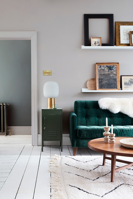
Often overshadowed by the following decade, the 1930s are a hidden gem of innovation in design. Colours from this time exude a tasteful tranquillity with soft pastels like Bone China Blue and Beauvais Lilac.
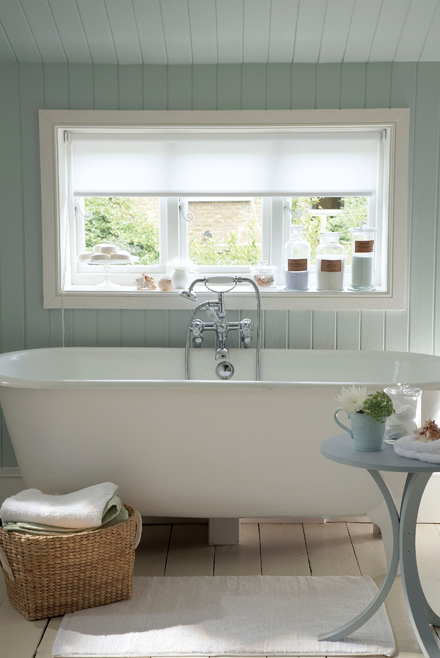
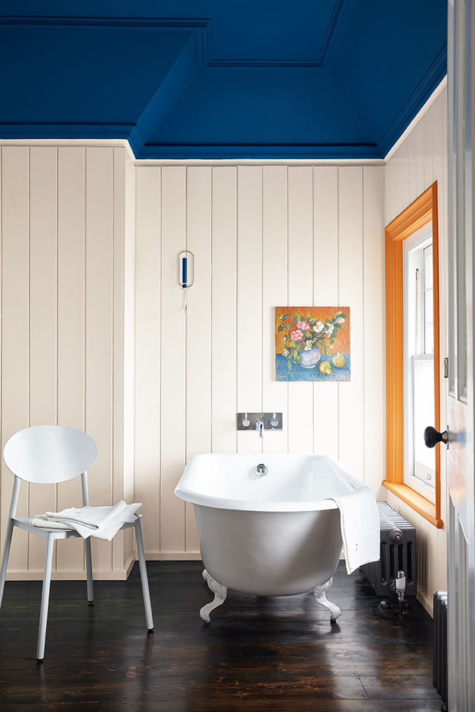
They also frequently draw on contrast with dark golds like Middle Buff along with bold but tasteful colours such as Goblin Greene and Air Force Blue. These colours can turn bathrooms like the one featured below into a calming canvas of relaxation.
1950s paint colours
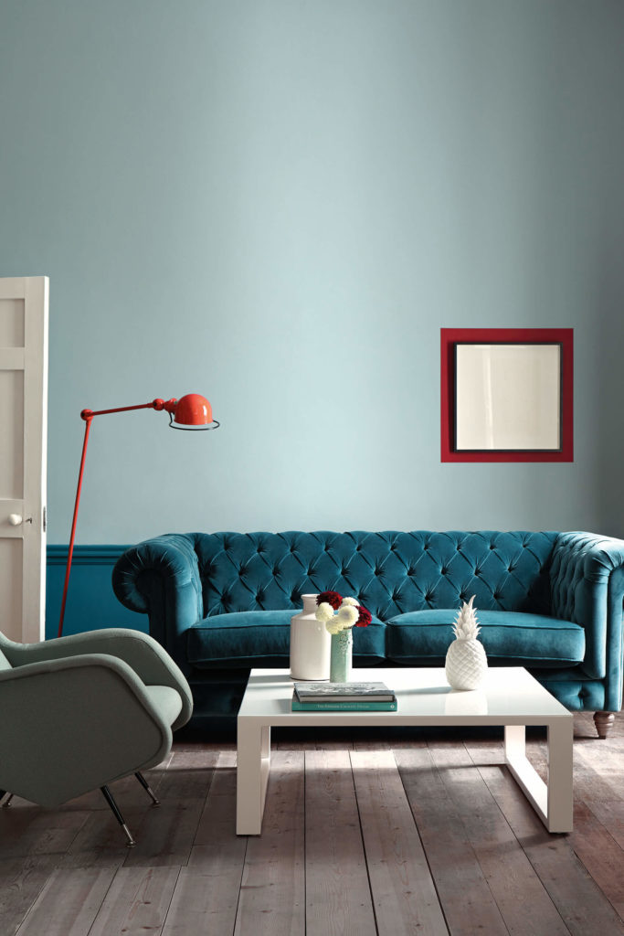
New technologies in artificial pigments hailed an avalanche of colour palette innovation in the 1950s. It also gave rise to pairings that are still popular today like sunny Citrine yellow paired with elegant colours like Portland stone or melancholic blues like Marine and Canton with historic sky shades like Celestial blue.
1960s paint colours
Fashion, music, politics, social norms, everything changed in the 60s, and so did interior design. The rebellious colour schemes of the 1960s ooze the pop culture revolution and express a stand against the austerity measures of the time. People wanted more from life and they started wanting more from interiors. Optimistic colours like Carmine and Dorchester pinks worked alongside iconic shades like Hicks’ Blue, empowering homeowners to craft bold interiors that were as striking as their favourite vinyl covers.
1970s paint colours
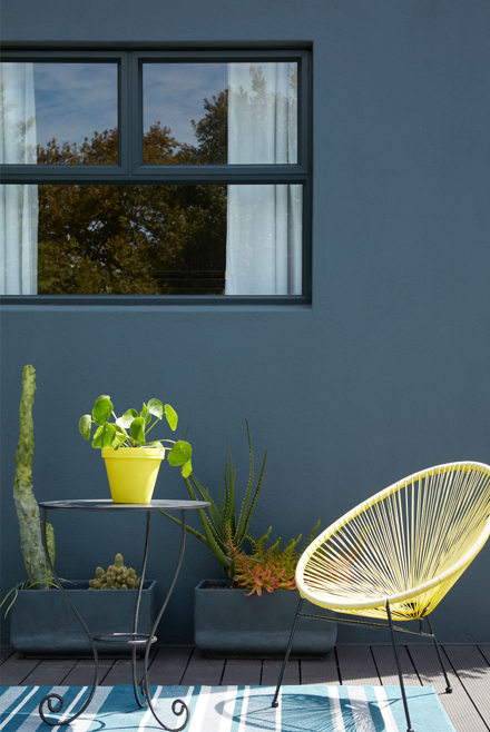
Another revolution in even more inexpensive synthetic pigments saw high-chroma colour make its mark on interior design. Bright shades were everywhere, and people wanted them in their homes.
Energetic colours like Phthalo green and Leather pink give a space an entirely new energy. Meanwhile, Atomic reds and Marigold oranges pair perfectly with more muted tones for statement areas like window frames, mantlepieces and feature walls.
Inspired & ready to elevate your home?
The perfect paint shade necessitates the perfect interior designer. Get in touch with Bellefair today if you’re looking to create a striking, timeless space.


