Not sure which Bauwerk limewash colour will look right in your Notting Hill home? This guide explains how London light shifts through the day, how undertones behave on limewash, and how to test sample panels so the final result stays calm, not patchy or surprising.
Short answer: The safest way to choose a Bauwerk limewash colour for a Notting Hill home is to pick a small family of related tones, then test large sample panels on your actual walls and check them in morning, afternoon, and evening light. Limewash shows undertones more clearly than standard paint, and London light can swing from cool to warm in one day. A calm result comes from good samples, controlled wall prep, and a clear decision on the final look before the full room. If you want help from survey to finish, see our Bauwerk limewash service.
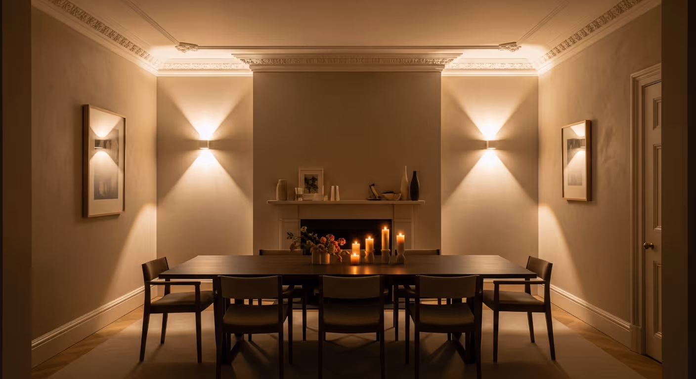
Notting Hill interiors often have strong personality, yet the best ones still feel quiet. Tall sash windows, high ceilings, and period plaster detail can make a room feel generous, but they also make colour choice harder. One shade can look warm and soft at 10am, then cooler by late afternoon, then richer at night under lamps. With limewash, this effect is stronger because the finish has depth and movement. That is the beauty of it, but it also means you should choose colour with care.
This guide explains how to choose Bauwerk limewash colours for Notting Hill rooms with changing light. You will learn how undertones behave, which neutrals tend to stay steady, how to test samples properly, and how to link limewash rooms with painted rooms so the whole home feels coherent.
London light is rarely constant. Clouds move quickly, streets reflect light back into rooms, and many Notting Hill homes have large windows that pull in strong daylight when the sun appears. Even within one room, a wall near the window can read differently to a wall deeper inside the space.
Three common patterns in Notting Hill homes:
Limewash reacts to these shifts because the surface is matte and mineral, with subtle tonal variation from the brushwork. A tone that feels simple on a paint card can look more alive once it is on a full wall.
Standard paint often looks more uniform. Limewash tends to show a softer movement, and the pigment sits in a mineral base rather than as a flat film. This changes how undertones read.
With limewash, you may notice:
This does not mean limewash is unpredictable. It means you should test it on your own walls. That is the step that turns uncertainty into confidence.
Many people try to pick the final colour too early. A calmer approach is to choose a direction, then narrow it down.
Good “directions” for Notting Hill limewash rooms include:
Once you pick a direction, choose two or three close options. If you jump across very different shades, it becomes harder to compare and the decision can feel noisy.
Undertone is the hidden colour bias inside a neutral. Two colours can look similar on a card, then behave very differently in a real room.
Common undertones to watch:
If you are unsure, start with a neutral that has a gentle warmth. In Notting Hill, that often reads more comfortable across the day than a very cool neutral.
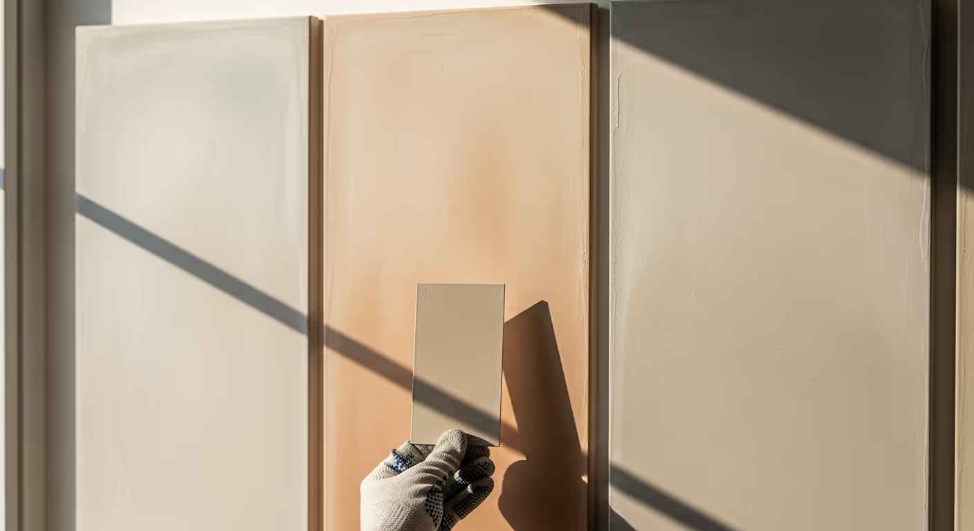
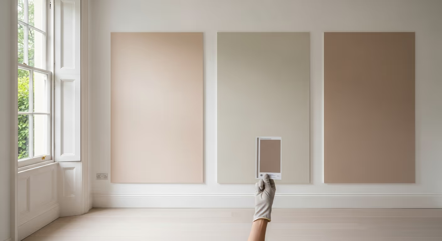
Sample panels are the most useful part of the process. They should be large, placed in the right spots, and viewed at the right times.
A practical sample plan:
If you only look up close, you will choose based on texture rather than on how the room feels. The real test is the doorway view, because that is how you experience the space day to day.
Sample placement changes what you learn. A panel in the wrong place can mislead you.
It can also help to hold your fabric samples or artwork next to the panel. Limewash is often chosen to sit behind texture and natural materials, so seeing them together helps you decide faster.
With limewash, wall prep can change colour more than people expect. Uneven suction can make some areas dry dull and others dry richer. Mixed surfaces can create subtle blocks. This is why we treat preparation as part of colour selection.
When clients ask why their limewash looks patchy, the causes are often:
When the base is unified properly, colour looks more consistent while still keeping the natural limewash movement. You can see our approach on the Bauwerk limewash page, and if you are combining finishes across rooms, our interior painting and decorating service helps keep paint and limewash working together.
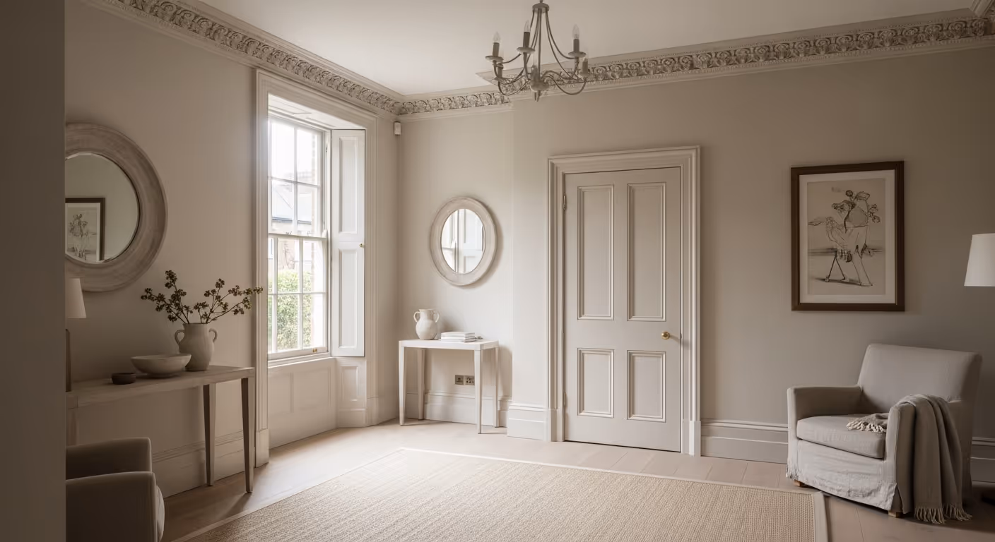
Notting Hill homes often mix period detail with modern furniture. Limewash colours that sit well with that mix are usually warm and calm rather than sharp or icy.
If you want a deeper mood, we usually suggest a toned down shade rather than a strong, saturated one. Limewash already has depth, so a slightly softer colour can still feel rich.
Many clients use limewash in key rooms, then use paint elsewhere for practicality. The goal is that the home still feels like one story.
Simple ways to link finishes:
If you are planning hallways at the same time, remember your client rule is matt or soft sheen on hallway walls, which can still be matched into the same colour family as your limewash choices.
Most of these mistakes are easy to avoid. The fix is a calm sample process and a clear decision before the full room starts.
Will my limewash colour look the same in every room? It will be related, but it can read slightly different based on light, wall base, and room size. That is normal, and sample panels help you predict it.
Do I need sample panels even if I know the colour? Yes. Limewash looks different to standard paint, and your wall base matters. Samples remove surprises.
Can I match limewash to paint exactly? You can match the family and undertone very closely. Exact match is harder because limewash has movement and a mineral base, but you can create a coherent scheme.
What if I hate the sample after it dries? That is the point of sampling. Adjust the tone and test again before committing to the whole room.
We carry out Bauwerk limewash projects across Prime Central London, with frequent work in Notting Hill, Kensington, Chelsea, Belgravia, Knightsbridge, and Westminster. You can see examples of our finish approach on our projects page, including homes such as the West London period home.
Want help choosing a Bauwerk limewash colour for your Notting Hill home? Send a few photos of the room, note the window direction if you know it, and share any colours you already like. We can suggest a small set of suitable tones, plan sample panels, and deliver a clean finish with the right base preparation. To begin, request a site visit and we will set a time that works for you.

Tell us a few details about your project and our team will review the enquiry and come back to you within one working day.